Now that I have my logo I can put it to use in other identity and branding aspects for the company. I wanted to start with the website.
After completing some research into existing websites for estate agents I had a rough idea of how to layout the website, so started here.
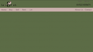
 I have gone for rectangles to divide the site but I am focusing on the top half which holds most of the important navigations and information. I am trying to decide on a typeface for the text used here but at the moment I am using Roman Serif by Manfred Klein, which I found when looking for a type for the logo. I am happy with the placement of the logo but after adding and removing items this may change. I have added a (made up) telephone number.
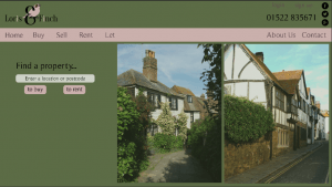
For imagery, I found two images of ‘country houses’ that I wanted to use from this site:
http://www.freeimages.com/photo/country-house-1228073
http://www.freeimages.com/photo/country-house-1228083
I will also want some social networking icons which I can get from flaticon.com
 I am not 100% set on these images as I would like to take my own, but I like where they sit and by taking the opacity down to 75% it has made them blend in well. I think due to the colours in the image it also helps it to blend in. I have added the social media icons to the top right which I may alter to help them blend in better. I’ve also added a ‘find a property’ feature which is a common feature on estate agents websites. So far I think this website has a good feel to it with the colour scheme giving it a strong identity. I also think it portrays the status of the estate agents well.
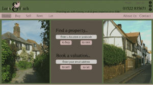
 I wanted a sort of slogan for the company to sit at the top of the site. I have added (a very bad) one for now as a placeholder, but hopefully can come up with something better. I’ve also re-arranged the centre layout. Work in progress…