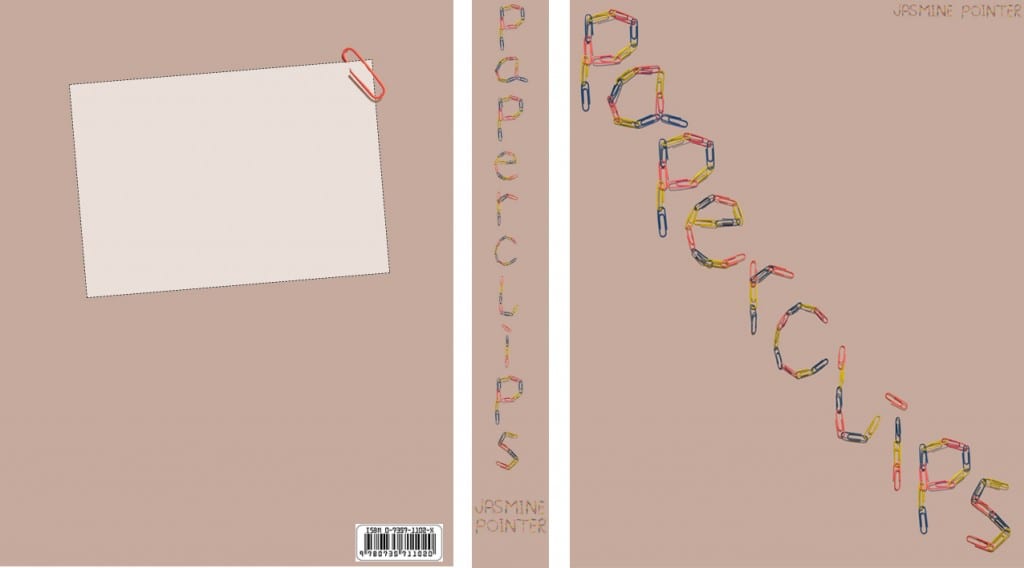
I decided to present my typeface on a typographic book cover design. As the type was made up with paperclips I thought the most obvious title for the book would be that.
I kept the cover simple using text only as I have seen others like it that were really effective and wanted to try it myself. The typeface has a lot going on anyway so I felt it would be too crowded with other images.
The main issue I had was deciding on a background colour that didn’t clash with the colours of the paperclips but I feel this beige/pink colour works well. I’ve included my name where the author name would be and to also include some uppercase lettering of my type. However, I think that it would have been better in another font to keep the attention on the main title. Keeping the shadows around the paperclips was a good idea as now it gives it a 3D look and really makes them stand out.
I’ve also designed the spine of the book and the back cover, which is a basic layout for information such as the blurb, publisher, etc to be added to. I felt I needed to include this in the design to show it clearly as a book cover design.
