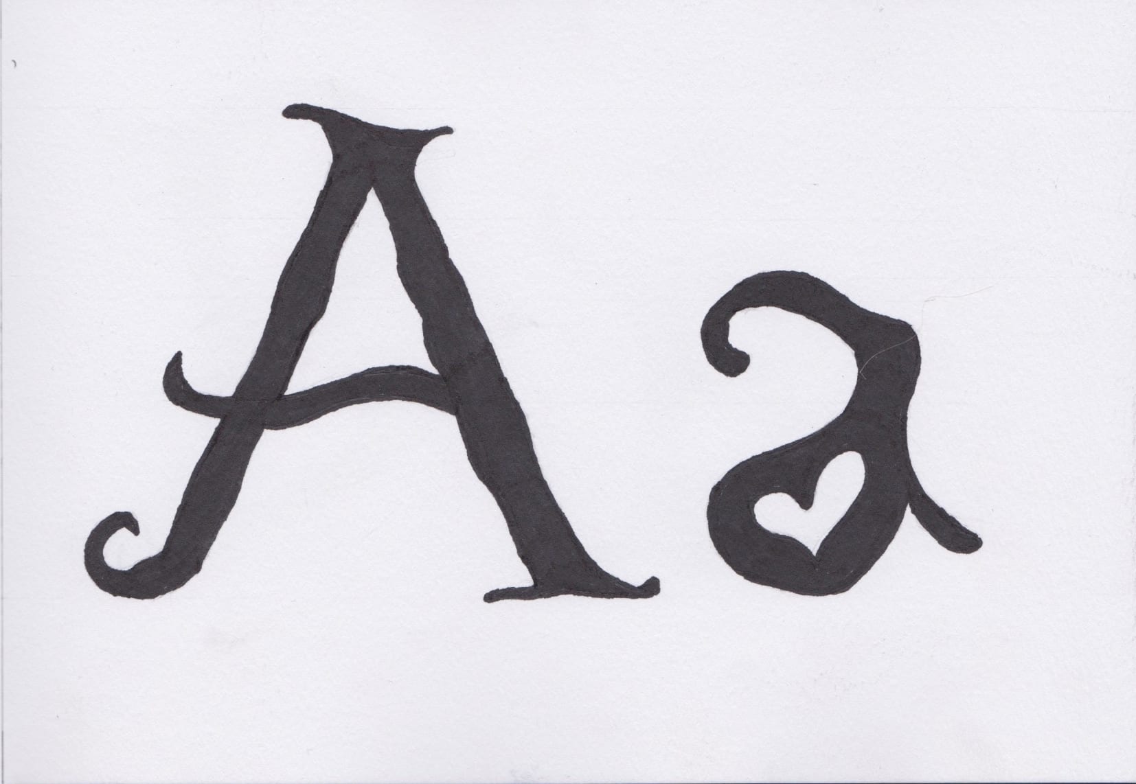
The typography project has been quite a struggle in ways as I couldn’t really think of an idea. However, since completing the project I have been thinking of other ideas I could have done! Either way, I am happy with what I’ve made even if I do feel improvements can be made. I feel my type would really benefit from me creating the whole alphabet and then maybe turning it into a computer based font.
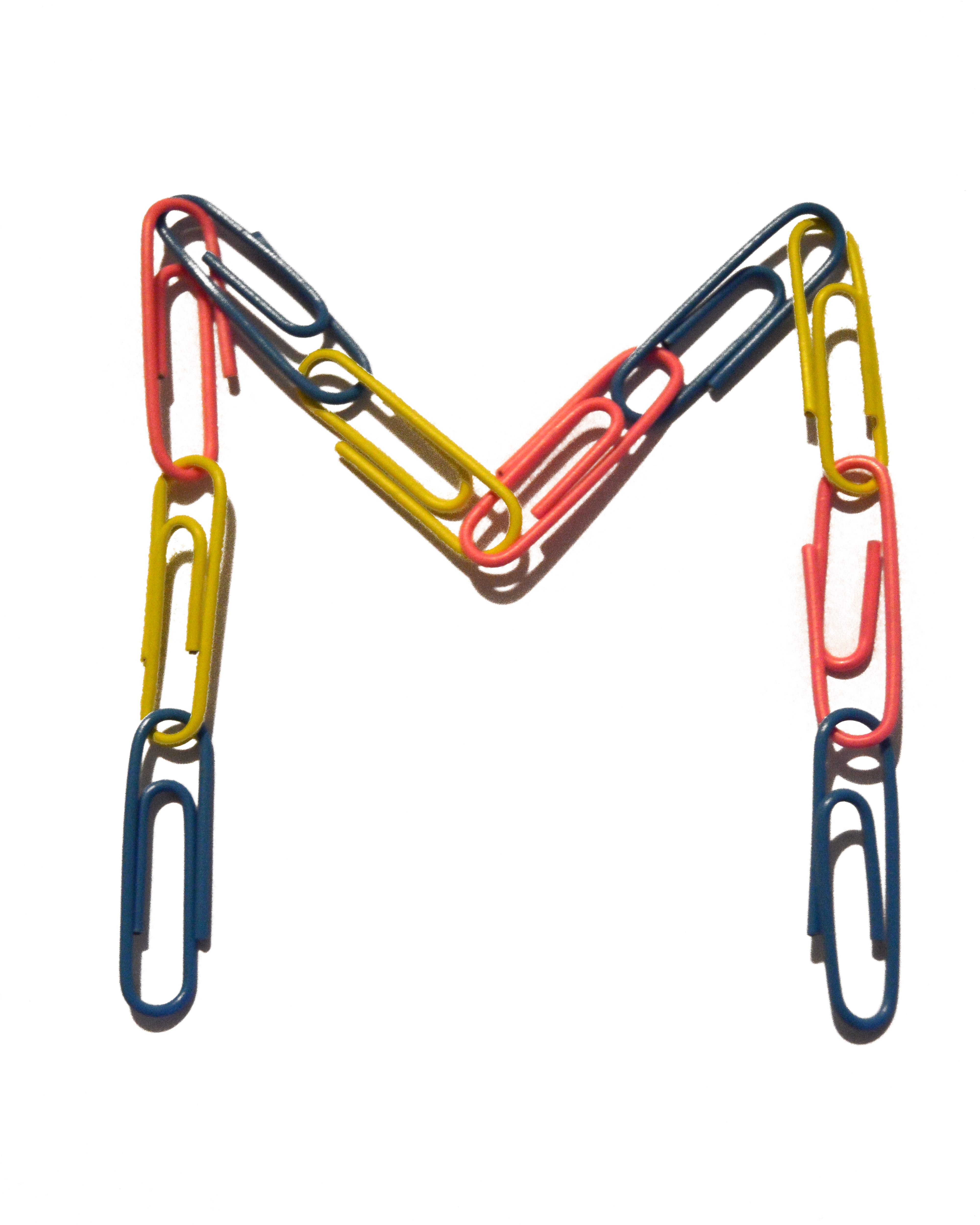
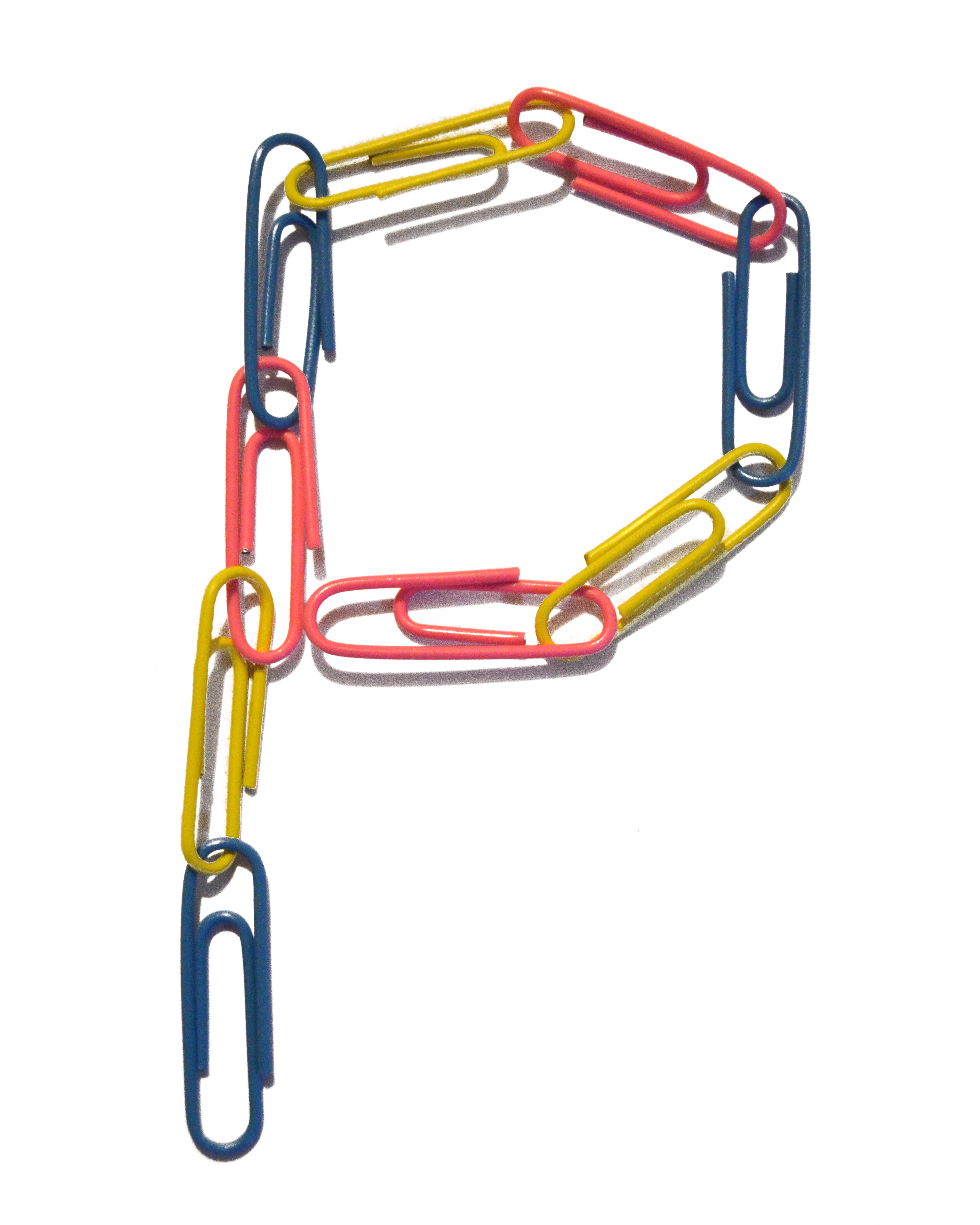
 Although I am happy with the final layout of my typography, I feel this poster appears a little dull. However, I was happy with the colour choice as it was the only one that didn’t really clash with the colours in the type. I feel the colourfulness of the type is an aspect that really works and makes it unique. I found creating this type quite a challenge as I had to photograph every letter I made and then edit them on Photoshop. However, although there is definitely improvement to be made there, I feel every letter has similarity in shape and style. I feel that if the editing process wasn’t so long winded I would have happily created the whole alphabet. I probably could of anyway but the letters wouldn’t have been to my almost perfectionist standard. I found myself using the eraser tool on background image that the ‘colour range’ tool did not pick up. If I did this on every letter of the alphabet it would have gotten tedious.
I also presented my type on a book cover which I think works well – I didn’t need much else going on on the front cover as the type has a lot going for it on it’s own. I made a little back page too but left it blank.
Doing this project has sparked an interest in typography and creating my own typefaces. After completing this project and the next I might have a go at doing this again with some of my other ideas I have in mind. I would like to create my own working font.