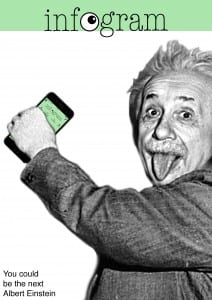
For the poster design I came up with the idea of Albert Einstein using the app I have designed for the mobile and web design. This would allow the poster to link back to the brief more than my app design does, while also making all of my designs link. However, in terms of the app itself being marketed by using Einstein – I would have to think of some link here so it makes sense. I could come up with a cheesy tag line such as ‘You could be the next Einstein’ (if you use this app) which isn’t a bad idea but needs some improvement and thinking into…
I decided to find a picture of Einstein just from google images so that I could have a rough go at this idea. I found this image which I thought would be a good one to place the phone into his hand so I started here. I removed the background of the image leaving Einstein and then I placed my already created iPhone mock up to this. I then added my infogram logo and the green colour I had been using along the top, as well as my current cheesy tagline and got this…
First Attempt
 This gave me an idea of what I could do with this poster design – I think its quite a humorous way of advertising the app and definitely draws your attention to it. I need to improve my tagline in some way and perhaps the layout of the poster – I could have a play around to see what happens when I make it less conventional. I think the image of Einstein works well, however it is not of high enough quality for an A2 poster so I will have to find another or maybe have a go at drawing Einstein.