I have come to the end of the Multi Format Data Visualisation project with final designs for the mobile desktop, online desktop, A2 poster and infographic.
Mobile Desktop
The idea I came up with for the mobile desktop output was a design for an infographics app after doing a lot of research into infographics myself and coming up with the idea. I searched for something similar on the app store and of course it already exists. The first result was a very poorly design app called ‘info.graphics’

The reason I found the design on this app so terrible was the general layout. This image here is the home page and it is not clear at all. There is no way to interact with the app, just the option to look at infographics. I found this poor and wanted mine to have a clear home page as well more options to interact with the app such as being able to create a profile and submit your own infographics.

 I feel I have successfully created this. The interface is clear and would be simple to use. There is nothing too distracting on the home page. I found deciding how to present the ‘most popular’ infographics section difficult and I feel there is still room for improvement there but I am still happy with this layout. It gives the user the option to swipe through the selection but it would automatically change by itself, too. This was a good opportunity to present my own infographic and see how an infographic.
I feel the mint green colour is very effective and gives a sense of clarity. It isn’t too crazy on the eyes, along with the rest of the layout. My home page has changed over time and has become simpler every time. Before, the search bar was bigger with the words ‘search’ and ‘e.g.’ to give examples of what you could search for. I found the website flaticon.com very useful in completing my app design and giving it that last touch. I think that making the icons myself would have been quite stressful and time consuming. I made little to no changes to the categories menu throughout the process and it works well how it is and would be simple enough to navigate. I also created another page which was specifically for presenting my infographic which can be seen on other posts and the ‘project two’ page.
Online Desktop
After choosing the name ‘infogram’ I decided to look at the Instagram website to see what their website contains as I’ve always thought of it as a smartphone application only. I found that their home page promotes the app but also gives the option to sign it which I thought I would do for my own. After creating this I was stuck with the idea that it would be my final design for the online desktop for a while but then I decided I needed something more. Therefore I created the page that would appear when you sign in. This is a Pinterest inspired page which presents a selection of infographic – or at least their title in order to intrigue the user into clicking on it.
  I am pretty happy with this page and think it works well. The web page would have the ability to keep scrolling down to reveal more and more infographics. In some ways it might be a little crowded and perhaps the layout needed more spacing or just changing to be very unconventional. However, as I thought I had gone down the conventional route with the app design and website home page that it makes sense for the style to keep it all similar.
Poster
The poster is the output I struggled most with as after creating the above two I didn’t know how to link it. I thought that promoting the app would be too simple and obvious, but after going with this idea I realised not. During designing this poster I found myself constantly thinking about the fact that the poster would be so big when printed that every little detail needs to be perfect. Therefore when I was creating images on Photoshop of Einstein I often ended up scrapping them as the standard wasn’t great. I had a feel very poor but quite funny mock up pieces I made – just to get my ideas on paper (or computer…). 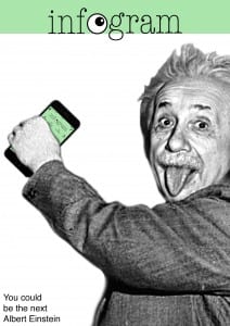
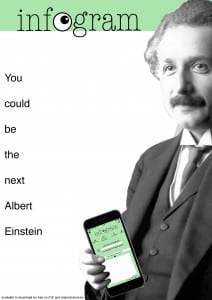 Even though these posters are not that great, I found the idea funny and wanted to stick with it. However, when it came down to creating my own image of Einstein on Photoshop I found it difficult. I ended up creating his head which looked okay but when added his body and his hand which would hold the phone it all fell apart.
 I didn’t feel it had the same effect that the first two did, therefore I did the same poster but with just Einstein’s head. This looked okay, but I still was not fully happy with it knowing it’s potential if I had the ability to do so. Therefore I came up with another idea of promoting the app which was through promoting my own infographic at the same time.
  I do like this design more than my original one but overall I am not 100% happy with either of the poster designs and felt I could have done better, I just wasn’t sure how.
Infographic
I struggled with an idea for the infographic for a while. I thought of ideas such as a space background with hand-drawn, cartoony planets in the background. However, when it came to making it I didn’t like the navy coloured background I kept choosing or any of the planets I attempted to draw on Photoshop. So I scrapped them all and started again. I thought that first off I needed to create my template and that I wanted to make an infographic that was quite long and thin. Whatever measurements I started with I ended up near enough doubling in the end once I got to adding elements to it. I feel the areas of improvement on my infographic is the amount of text used. Although the infographic does have a lot going on visually and graphically, it does show itself as an infographic but it could be argued that its too text based for one. However, I have kept the textual information short and to the point (partly because I don’t know an awful lot about the theory and partly because I didn’t want to go too crazy when explaining it). I wanted an infographic that explained a lot of key points and some fun facts about Einstein so it didn’t throw the viewer off of something so complicated.
Audience
When I started this project I stated that I would make my designs for kids. I planned to do this as I thought then this way I would not have to go too in depth on the theory and could do something quite simple. But as it turns out I have done this anyway. You could say my app package and infographic appeals to a wide audience. As I have done a 100 year special infographic of the theory of relativity it could appeal to physics students as well as physicists who are just viewing it to appreciate it and the fact it is the 100 year mark. The Infogram app could appeal to teeangers and adults, students and designers. However, I’m not sure any of it would appeal to primary school children that much.
I have had a lot of fun doing this project despite the stress of not knowing what to do at times. I am proud of what I have made and the depth I have gone into the project. I feel its the most effort I have put into a design project before and it has made my interest in the subject grow.


