 At this stage I have added a large bulk of information to my design and I feel like it is a reasonable amount and doesn’t look too crowded. I need to adjust the top part with the Einstein facts as I am not 100% sure how to present this part. I was thinking of continuing with facts down the sides of the infographic but I don’t want to overload it. I am also wanting to add small cartoon style images down the sides such as rockets, astronauts, asteroids, stars, etc.
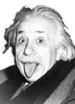
 I found an image of Einstein here – which I edited to remove the background and once I added it to the infographic I removed more of the image and took the opacity down. In terms of fonts I have added another one for the ‘did you know?’ text (which I am still unsure of) which is a font called gimme space from dafont.com. I am pleased with the way the infographic is coming along so far but I still feel like I’ve got a lot to do with it yet.
I have now added more facts to my infographic and spread them around the page. This left spaces that
 needed to be filled so I decided to add some imagery. For these I mainly found an image on Google and then traced over it on Photoshop. For the asteroid and galaxy images I went to a royalty free website (here) and found this image and this one. I then removed the background on them and added that to my infographic. After positioning these around the text I felt my infographic was finally finished. I think that adding too much more would make it too crowded and over done. It isn’t overloaded with information, making it clear to read and understand. It also isn’t too serious with the fun facts I’ve added and the cartoon style imagery gives a fun touch.