Improved Work

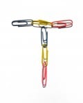
I have worked on my paper clip type by re-doing it and taking photos of the final letters on a Nikon D3200, for better quality images. I edited them on Photoshop with the Colour Range tool to remove the background which was a very quick and simple way of doing so. I decided to keep the shadows in the image to give the letters a three dimensional feel. I plan on presenting the typeface on a book cover and/or poster.


Research: Book & Poster Design

I have already presented my typeface using a PSD mock-up but once I improve my design and complete it, I would like to present it on a book cover/poster, therefore I have been doing some research into book/poster design which relates specifically to my own ideas.

Books

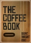
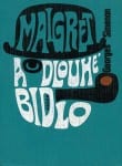
I would want my book cover design to be text based with no illustration so I thought typographic book covers would be the key type of design to look into. I found an article that features 30 typographic book covers which I had a look at for inspiration (here). This article shows me how effective these designs can be and that I can make mine work on a cover like this. There is the option to add shapes to the design to give it something extra, or to completely simplify it and just have text. These designs stood out to me the most from the article:
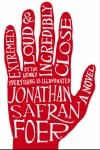
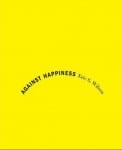
image9 image14image28image22

Poster

The poster design will most probably be as simple as the book cover design, as it would be an advert of the book. I feel my type would be very effective on a poster as it stands out well with the colour, size and three dimension it has.

Posters “influenced the development of typography because they were meant to be read from a distance and required larger type to be produced influenced the development of typography because they were meant to be read from a distance and required larger type to be produced”

design history

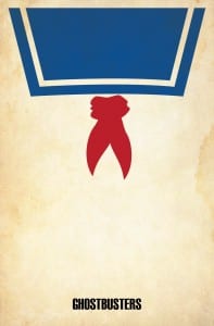
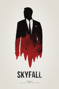
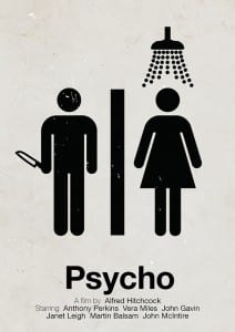
I love minimalist film posters such as these:
29-31-minimalist-posters Brickhut_Ghostbustersskyfall_poster_by_hvejsel-d5pa0cj

I plan on using text only in my poster design, so I’m wondering how well this will work. I might need a small image or to add some kind of shape design to it, but then my typeface might work well on it’s own. After googling ‘typographic posters’ the results all show very busy posters with a lot of text. I don’t know how I would create something similar to this using my typeface, as it might look quite busy/messy. I planned on creating a word or two and displaying it that way, or perhaps just individual letters in a jumble – so it’ll be interesting to see how this works for me.
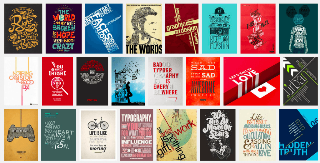
Typographic Posters on Google

Mockups

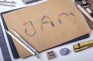
In today’s workshop I added my existing typeface to a PSD mockup to see what my type would look like when used in a design. With the only letters I’ve created so far I made this:

mockup-jamI’m not quite sure how I feel about this presentation. I will be looking into other ways I can present my typeface in order to showcase it well, such as on a poster or book cover. I will create more letters so I’m able to present the type with more thought.


Work In Progress

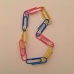
After deciding I wanted to create a type by hand out of physical objects, I then sat down to think up some ideas. I came up with a few ideas for objects I could use including feathers, pencils, paper clips, paper shreds or leaves. I decided to go with paper clips and had a go at attaching several together and shaping them into letters. This is what I got:

With this I decided it was too basic and therefore I transferred the images to Photoshop to turn them into letters for fonts.

I did this by removing the background of the images, leaving the paper clips, with the background eraser tool. This made them look a lot more appealing and it allowed them to stand out. This is the result:


I think in order to appreciate the style of this type I will need to create the whole alphabet but editing them has made a good difference. I will be editing them further to perfect them (the editing is patchy and needs sorting) and I also want to play around to see what changes I can make to them.

Everyday Type

Screen Shot 2015-10-14 at 15.59.30


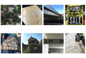
It’s interesting to focus on the type that surrounds you day-to-day. Before doing this project this is something I’d not really thought about, but now its hard not to. I found a range of different type, some boring (the lift sigh) and some interesting (the ‘city of lincoln’ written on the lampost). This was a good exercise to get my mind focusing on typography.