International Typographical Style: Modernism Lecture
Todays lecture talked a lot about Helvetica and the varied views different designers have on it. I’ve always looked at Helvetica to be a plain, simple and dull typeface. However, after seeing the work of Josef Muller Brockmann, I changed my mind.
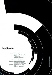 His design is so simple yet effective by the way he has used Helvetica. He uses no uppercase lettering which creates a certain style and image. The way that ‘beethoven’ has not been made a big deal for example, by blowing it up, it has drawn more attention to it. The background design also draws attention to it by the way it is shaped. I love the clarity of this poster and it’s minimalism is refreshing.

Josef Mullar Brockmann, 1955, ‘Beethoven’
We also watched an extract from ‘Massimo Viginelli: Film Helvetica’. Viginelli explains how he disagrees that type should be expressive and this is why he likes Helvetica. However, I disagree with him as I feel that, especially with the range of type there is these days, all type is expressive and has a certain effect on a design.
However I do like what Brockmann has done with his design and I think I will try to incorporate my own typeface into a minimalist design like this to see if I can create a similar effect.