My original cover of Speck the Sphynx Cat was quite dull and boring.
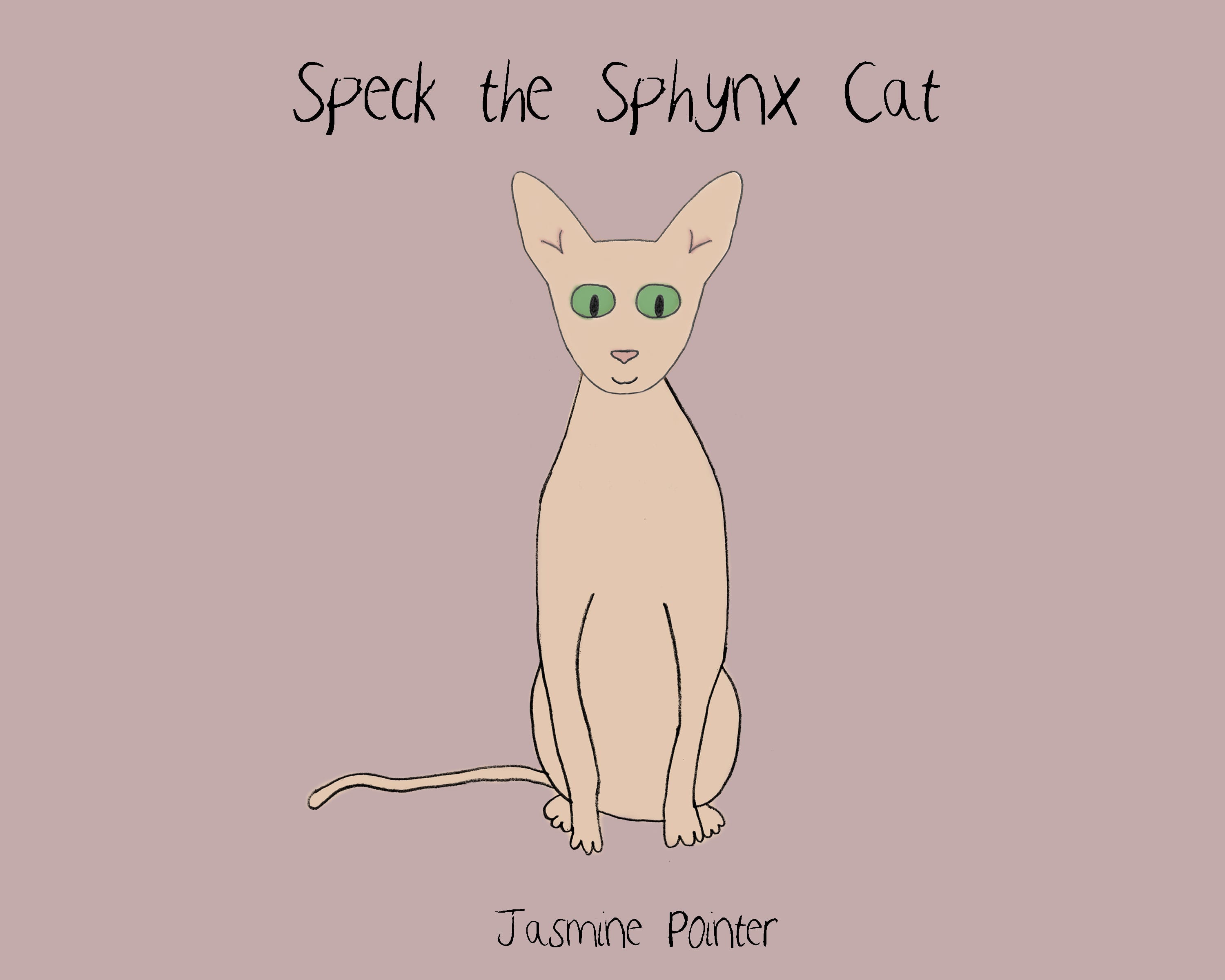 It had nothing big and ‘wow’ to stand out and attract a 3-7 year old. Therefore my next step was the increase the size of the title.
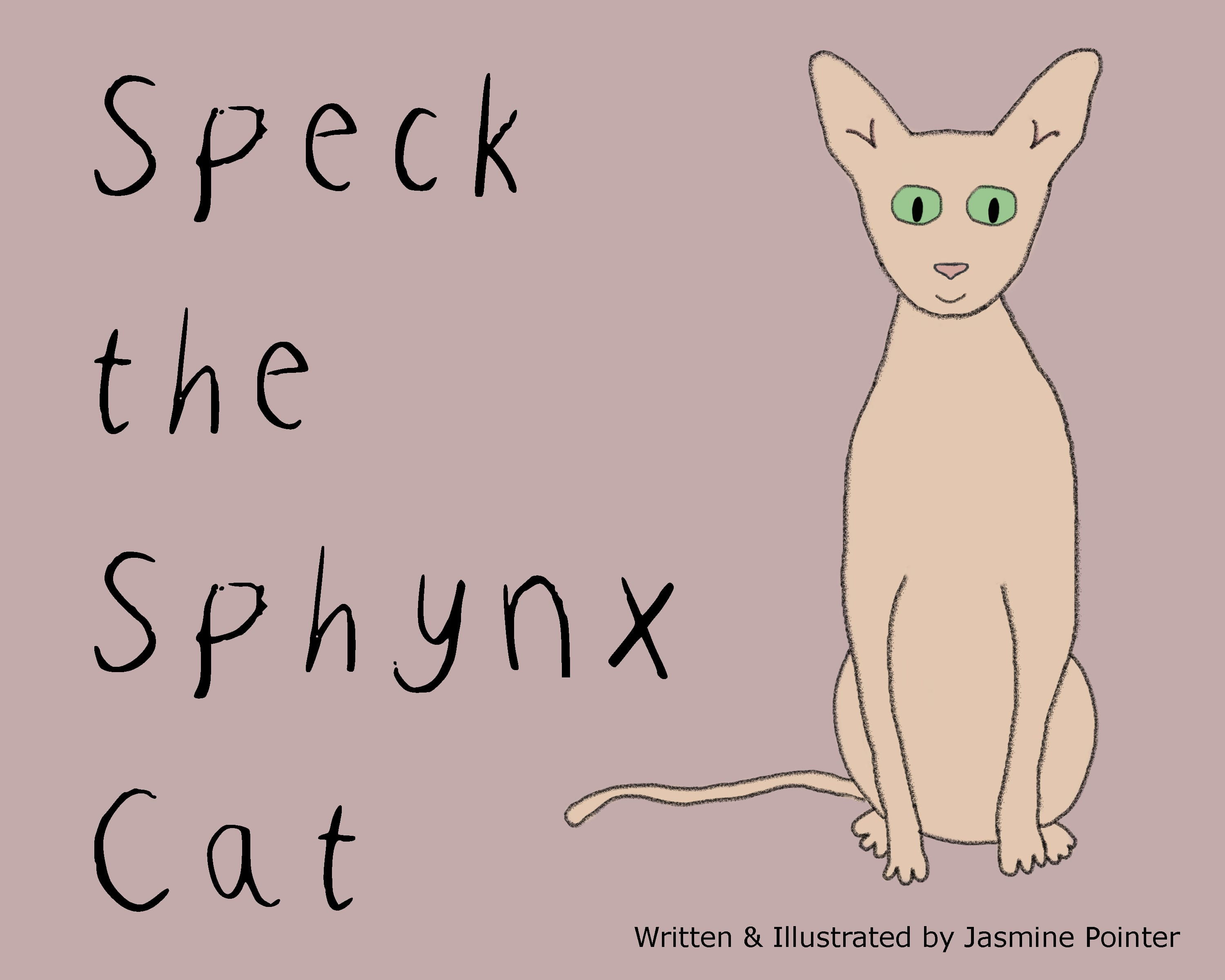 This allowed me to also increase Speck and make the overall cover look bigger and eye catching. However, it was still dull and needed more.
After improving Speck so that his jumper now has a rainbow print on it, I decided to use this within the cover. Firstly, I changed the background to white and the text colourful.
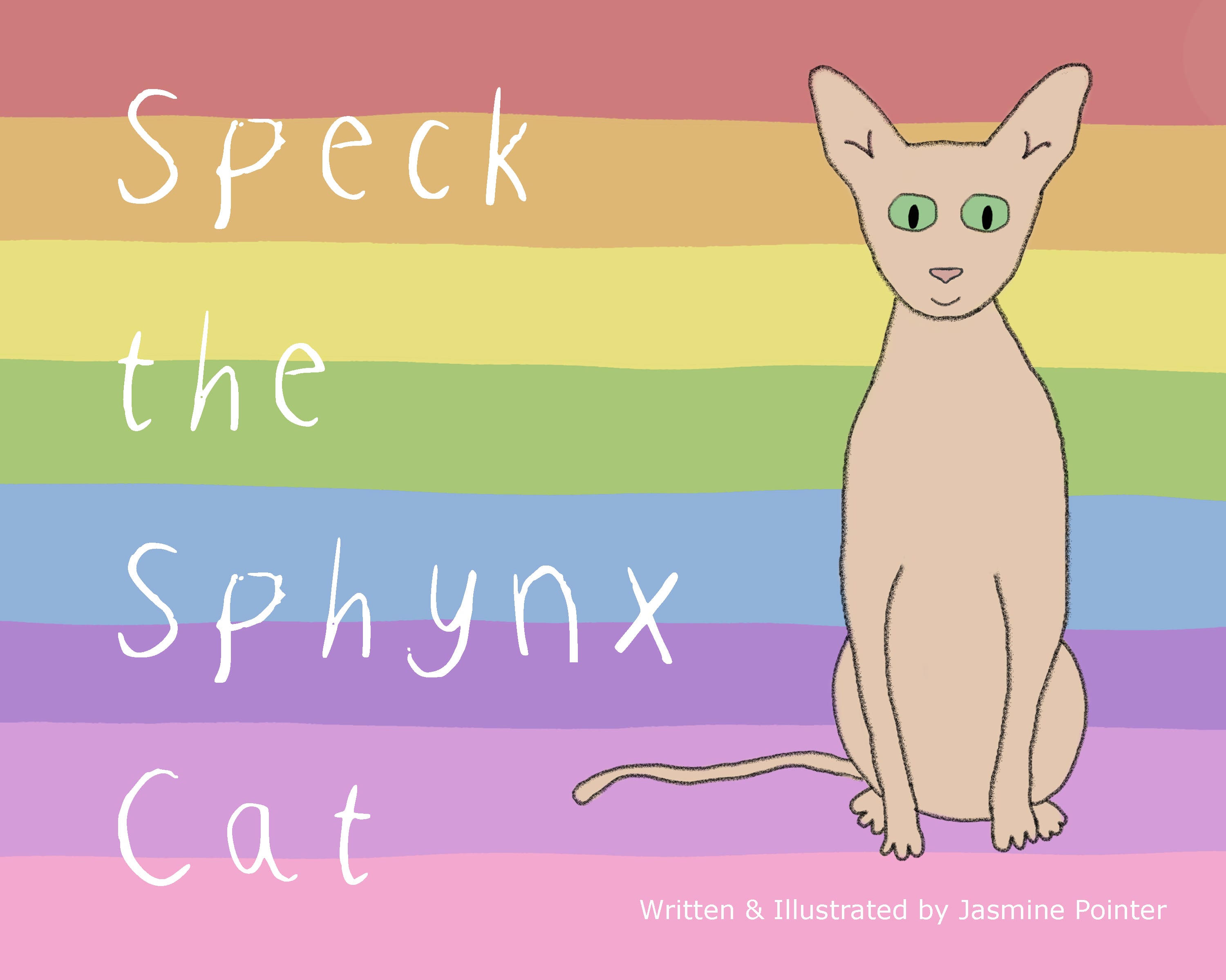
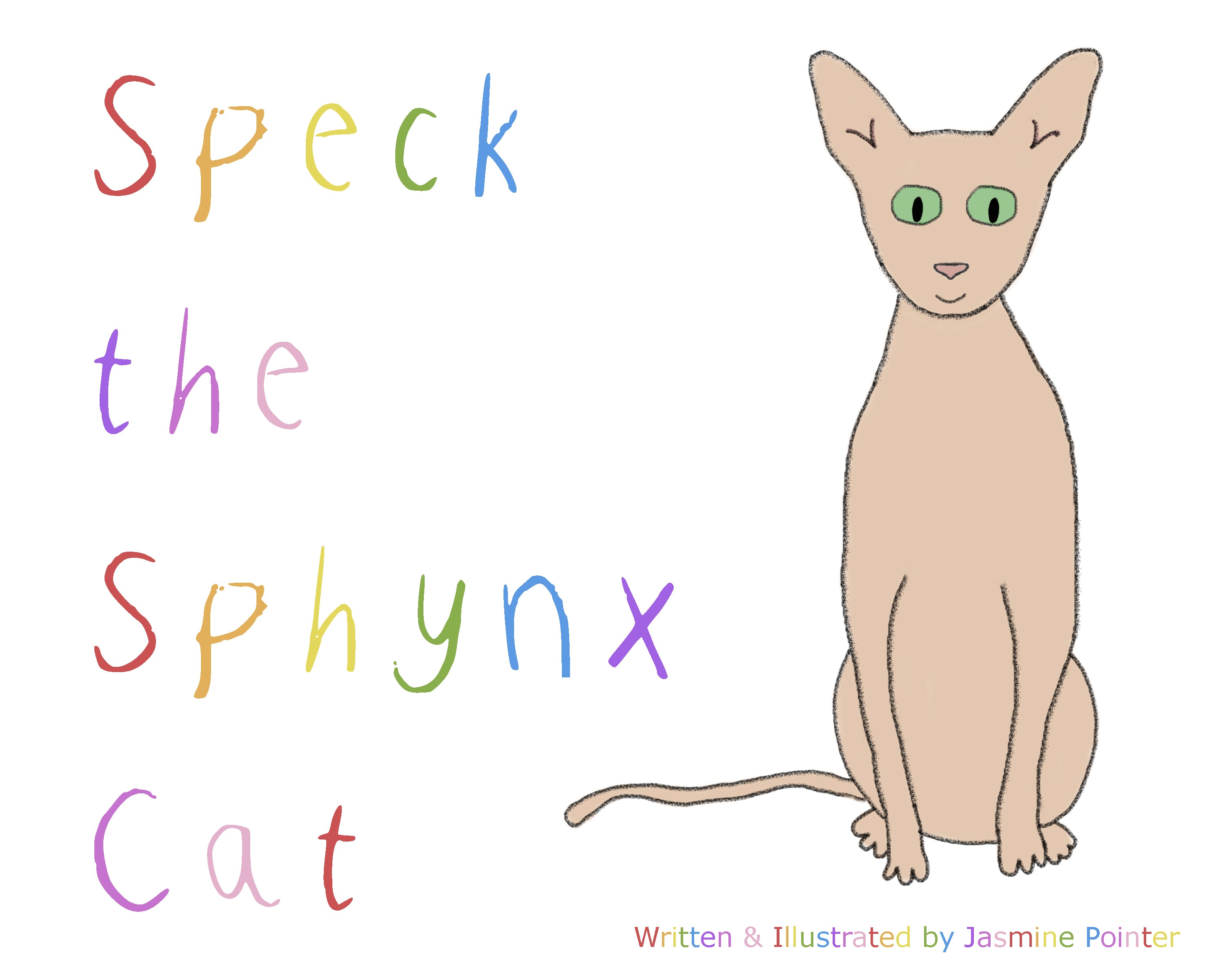 I liked this, but I still felt that to a child it wouldn’t make them pick this book up from a selection in a library, due to the white background. So, I took the rainbow look a step further and got this:
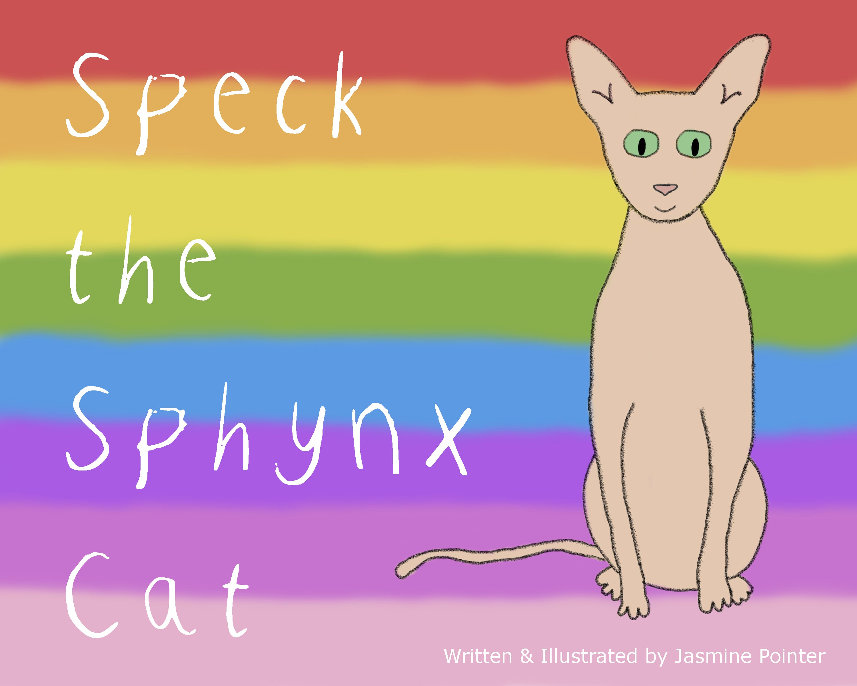 To me, this looks a lot more like a children’s book. It would catch a child’s eye, as well as an adults. I like the white text over black, I think its more appealing and takes away anything dull from the page.
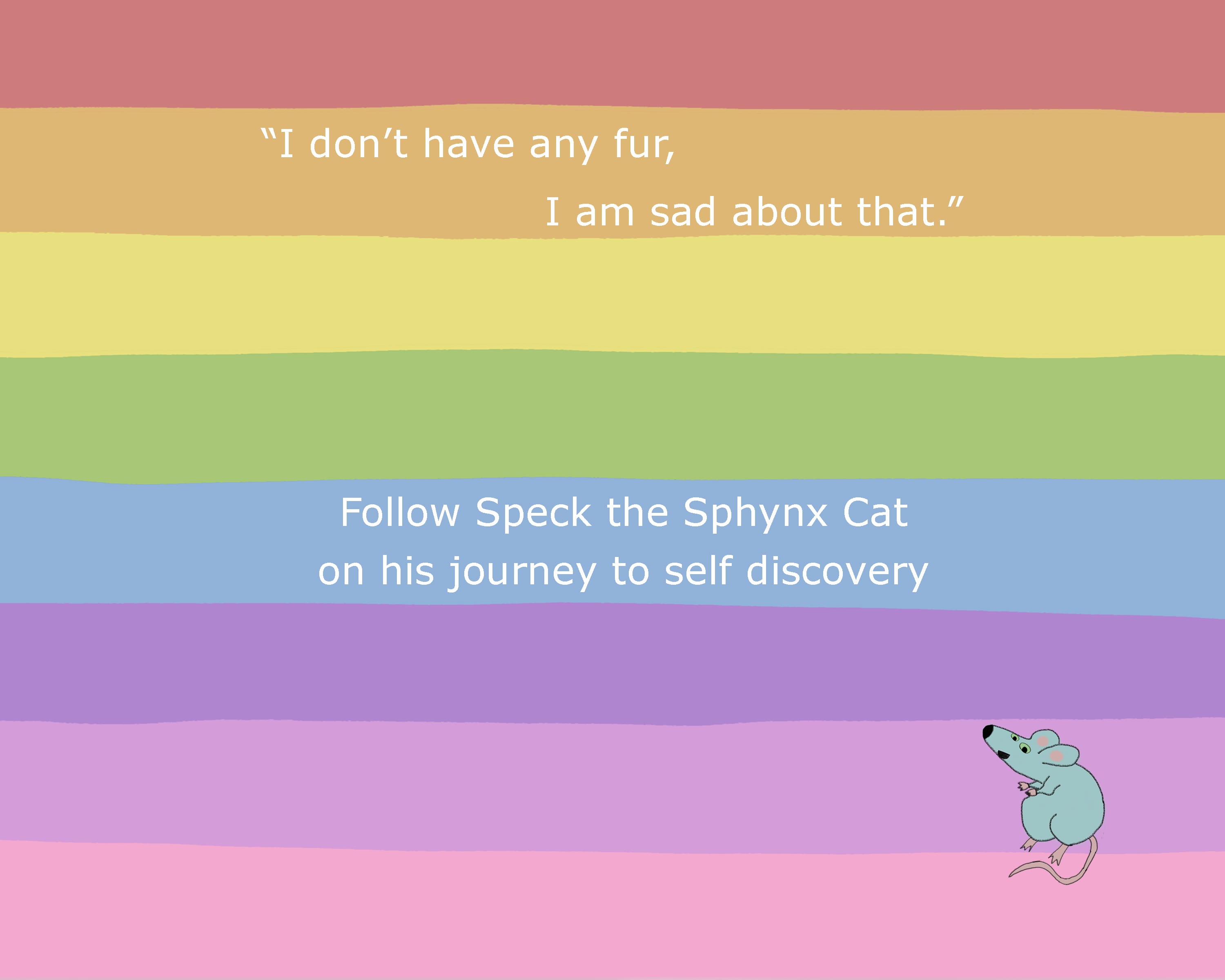
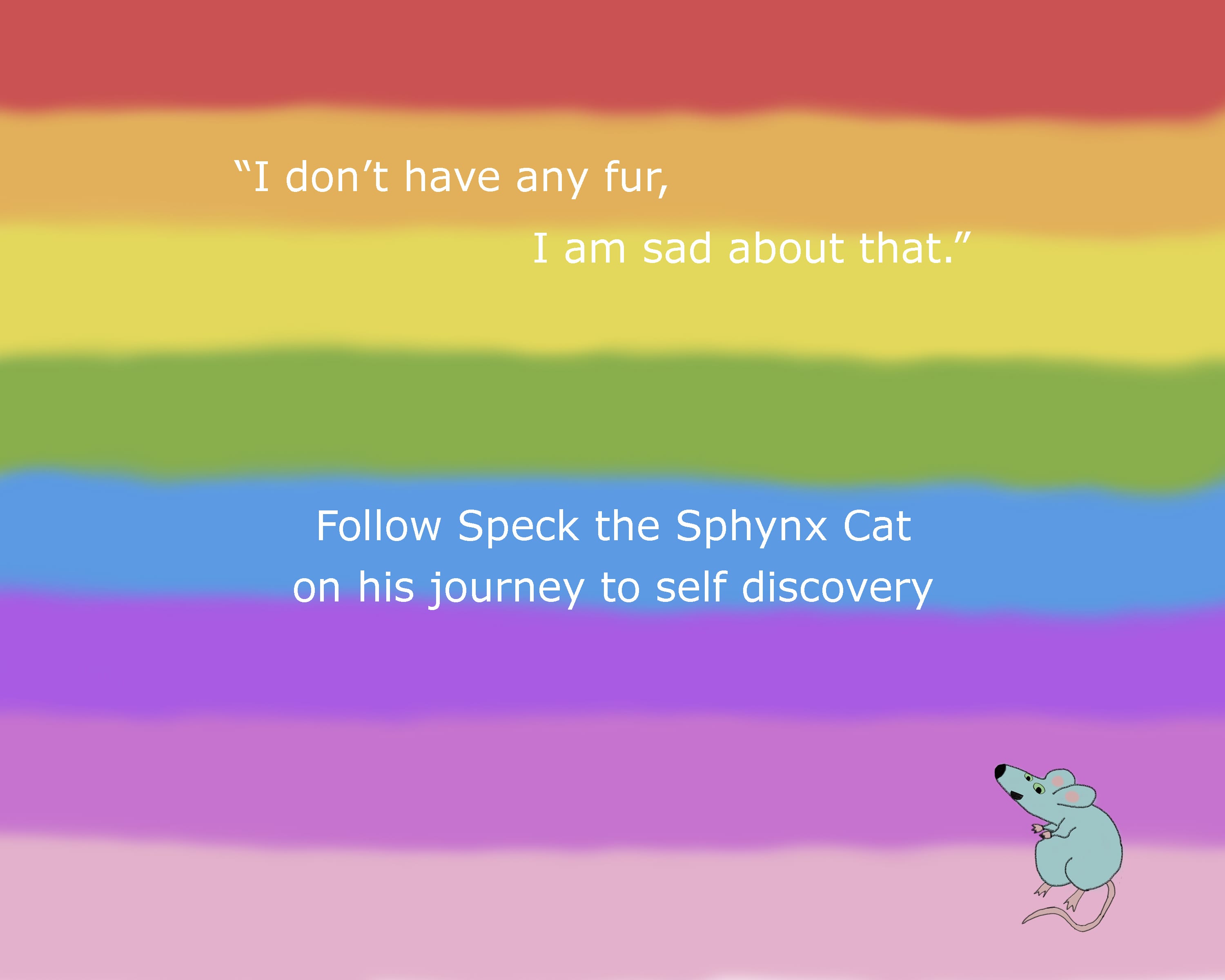
I carried this design over to the back cover, too where I’ve added a short blurb to go with the quote. However, this isn’t finalised, nor is the overall layout for the back cover.
 Since changing the front cover to the rainbow version, I have been thinking of a way to have the backgrounds on each page. Currently, they are all pale colours and alternate between a red, yellow, blue and green. I thought that with using the rainbow theme on the front, I could continue this throughout. So I changed the background colours to the rainbow colours used. However, these were too bright and vibrant on some pages and did not suit the page well, so I had to make the colour more pale. I then changed the front and back covers to use the same pale colours, but I think I’ll keep Speck’s jumper the same vibrant colours they are.