To start off the mobile design I wanted a template to work around such as the iPhone status bar at the top of the phone. I did some research and found that the font used for this is Helvetica, so on Photoshop I started to create it myself. As well as the text that appears such as the time and battery percentage I wanted to add some icons, therefore I took a screenshot on my own phone and added them to my design. I then went on ‘layer’ and ‘flatten image’ and this gave me my mobile template.
I started my design by making a (very basic, but hopefully effective) logo for my app ‘infogram’
 I used a font called ‘American Typewriter’ from dafont.com. Then I made the eye out of ellipses on Photoshop.
From here I started designing my app by adding shapes, text, colour – whatever I could think of that my app would need.
I knew I would be needing icons throughout my app design and therefore I went to www.flaticon.com.
I will design a home page, menu and a page which will show my own infographic.
Home page:
 I have started by adding everything I could think of that would be needed on an app user interface including the logo, a sub-menu leading to a categories menu, an option to submit an infographic, access to your own infogram page (which would show all the infographics you have saved, liked, shared and submitted) and to sign in. I’ve also added a search bar which is clear and easily accessible as well as a most popular section to show a selection of infographics that could change every 10 seconds or so (my infographic would be shown here). Next I will add in imagery such as icons and some infographics for the most popular section which I have found on mashable.com. I chose the colour at random (sort of). I knew I wanted a pastel colour so I went on the colour palette and went through all the colours available and decided I liked this one best.

I’ve now added icons that I got from flaticon.com a well as infographics from mashable.com which has really made a difference and given it a finishing touch. I have also added ‘developed by’ text at the bottom to give it a professional touch. I’m not too sure about the layout of the ‘most popular’ section – the infographics appear stretched and you can’t really understand them. I will have to find a way to improve this.
Although I will be featuring infographics in the ‘most popular’ section, I am wanting to play around with this some more to see different ways of presenting them as at the minute it looks a bit odd and stands out too much.
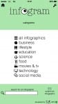
Menu and Infographic Page:

 I took the same approach with these two pages and started off with basic components and then added to them with icons to make it come alive. I have left space for where my own infographic would go and then there is the option to save, like and share it. Obviously I have used Helvetica throughout my design and I like the minimalistic feel it gives. However, it could appear lazy and boring to some, therefore I might play around with other fonts. I didn’t want to do this right now as I thought if I keep it simple it would make the process easier which it has, and trying new fonts might complicate the process. Now I have my app design near enough complete I can experiment with other fonts.
 I’ve also made an icon for my app.
 I have overall simplified the home page for the mobile design. I removed the ‘search’ title as I thought the rectangle and magnifier icon made it clear that you can use this tool to search. The ‘most popular’ section has been simplified by only featuring one infographic at a time. There are arrows to show you can flick through the most popular infographics and a symbol below to show you can click to see more. The infographic has been halved to make the information clearer and if a user wanted to see the whole thing they would click the infographic and be taken to the page featuring it.
 I have also removed a few items from this page including the ‘scroll down’ text and ‘submitted by…’ text.