Infographic Design

infographic step 1
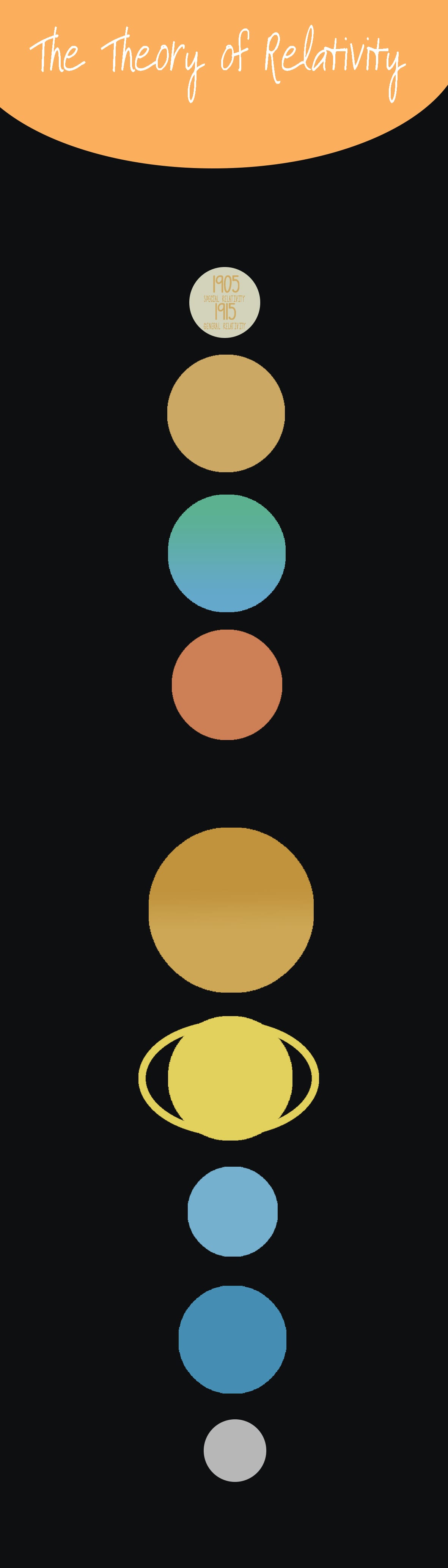
Whilst working on my infographic on Photoshop by playing around with colours and shapes I came up with the idea of splitting the information into sections down the infographic. I started off by using rectangles and changing the colours of each which lead me to the idea of having each rectangle the colour of a planet which then lead me to using ellipses instead of rectangles and displaying the solar system down the page.

Just like in the top planet on the infographic, I will display information in each one as well as around them, using each one to give a small fact. I like what I’ve got so far but once I start to add information, other images, etc. my layout will probably end up changing. So far I have gone from a 9cm by 15 cm canvas to a 10 cm by 35 cm so it may get bigger/longer yet…


infographic step 2I have now started to add information to my infographic and after adjusting the design. the planets and the title, I have had to make it bigger (its now 15cm by 60cm). I have created a much better main title at the top of the infographic and I’ve decided to make it all about the fact that it is ‘100 years of the theory of relativity’ this year. I’ve made the planets straight in the centre of the design so it looks much neater and I’ve brought the opacity down so it all blends in better. I thought it would be good to find a royalty free image of Einstein that I can edit and put on the top of the design followed by facts on Einstein himself before going into the theory. At the bottom of the infographic I will add links to the sites where I got all my information from.

My title font is Photographs from dafont.com and the main font is Fh_Space from dafont.com.

Poster Design

For the poster design I came up with the idea of Albert Einstein using the app I have designed for the mobile and web design. This would allow the poster to link back to the brief more than my app design does, while also making all of my designs link. However, in terms of the app itself being marketed by using Einstein – I would have to think of some link here so it makes sense. I could come up with a cheesy tag line such as ‘You could be the next Einstein’ (if you use this app) which isn’t a bad idea but needs some improvement and thinking into…

I decided to find a picture of Einstein just from google images so that I could have a rough go at this idea. I found this image which I thought would be a good one to place the phone into his hand so I started here. I removed the background of the image leaving Einstein and then I placed my already created iPhone mock up to this. I then added my infogram logo and the green colour I had been using along the top, as well as my current cheesy tagline and got this…

First Attempt

Infogram Poster first attemptThis gave me an idea of what I could do with this poster design – I think its quite a humorous way of advertising the app and definitely draws your attention to it. I need to improve my tagline in some way and perhaps the layout of the poster – I could have a play around to see what happens when I make it less conventional. I think the image of Einstein works well, however it is not of high enough quality for an A2 poster so I will have to find another or maybe have a go at drawing Einstein.

Web Design

As I’ve gone for the name ‘infogram’ (inspired by instagram) I thought I’d look at the instagram website for ideas for my online desktop design. Their website seems to promote the app bScreen Shot 2015-11-18 at 16.20.56ut you can also sign in and view images and your own profile – therefore I had the idea of doing this for my own.

I used the Instagram web page to give myself a starting point and thought it would be effective if I also displayed my app on a phone. Therefore I downloaded a PSD mock up and placed my own app on. I added these to my blank web page template and from there I added my Infogram logo. Then I added similar content to the Instagram page such as sign in, the option to download the app and useful links e.g. about us, support, privacy, etc.

Infogram website home step 1

Infogram website home

Mobile Design Process

Screen Shot 2015-11-17 at 15.54.21

To start off the mobile design I wanted a template to work around such as the iPhone status bar at the top of the phone. I did some research and found that the font used for this is Helvetica, so on Photoshop I started to create it myself. As well as the text that appears such as the time and battery percentage I wanted to add some icons, therefore I took a screenshot on my own phone and added them to my design. I then went on ‘layer’ and ‘flatten image’ and this gave me my mobile template.


I started my design by making a (very basic, but hopefully effective) logo for my app ‘infogram’

infogram logoI used a font called ‘American Typewriter’ from dafont.com. Then I made the eye out of ellipses on Photoshop.

From here I started designing my app by adding shapes, text, colour – whatever I could think of that my app would need.


I knew I would be needing icons throughout my app design and therefore I went to www.flaticon.com.

I will design a home page, menu and a page which will show my own infographic.

Home page:
Infogram home step 1I have started by adding everything I could think of that would be needed on an app user interface including the logo, a sub-menu leading to a categories menu, an option to submit an infographic, access to your own infogram page (which would show all the infographics you have saved, liked, shared and submitted) and to sign in. I’ve also added a search bar which is clear and easily accessible as well as a most popular section to show a selection of infographics that could change every 10 seconds or so (my infographic would be shown here). Next I will add in imagery such as icons and some infographics for the most popular section which I have found on mashable.com. I chose the colour at random (sort of). I knew I wanted a pastel colour so I went on the colour palette and went through all the colours available and decided I liked this one best.

Infogram home step 2

I’ve now added icons that I got from flaticon.com a well as infographics from mashable.com which has really made a difference and given it a finishing touch. I have also added ‘developed by’ text at the bottom to give it a professional touch. I’m not too sure about the layout of the ‘most popular’ section – the infographics appear stretched and you can’t really understand them. I will have to find a way to improve this.

Although I will be featuring infographics in the ‘most popular’ section, I am wanting to play around with this some more to see different ways of presenting them as at the minute it looks a bit odd and stands out too much.

Menu and Infographic Page:


Infogram menu final
Infogram my infographic final
I took the same approach with these two pages and started off with basic components and then added to them with icons to make it come alive. I have left space for where my own infographic would go and then there is the option to save, like and share it. Obviously I have used Helvetica throughout my design and I like the minimalistic feel it gives. However, it could appear lazy and boring to some, therefore I might play around with other fonts. I didn’t want to do this right now as I thought if I keep it simple it would make the process easier which it has, and trying new fonts might complicate the process. Now I have my app design near enough complete I can experiment with other fonts.

infogram iconI’ve also made an icon for my app.


Icons made by Bogdan Rosu from www.flaticon.com is licensed by CC BY 3.0

App Design

I feel like the best app designs in terms of how clear they are to use, use bright or pale colours that are easy to look at. Therefore this is the route I am taking – I will use mainly pastel colours. I googled ‘best app design’ to get some inspiration for layout and where to start and found these designs that are in line with the colour choices I had in mind for my own:

bHkwEdK

SICUITL

cartela


I have found that apps are usually quite minimalist which makes them clearer and refreshing. I want mine to have a similar style – maybe not necessarily having very little going on but by using ‘simple’ fonts. I am thinking of using Helvetica to see how it would look.