Final Design: Typographic Book Cover

Paperclips book covers


I decided to present my typeface on a typographic book cover design. As the type was made up with paperclips I thought the most obvious title for the book would be that.

I kept the cover simple using text only as I have seen others like it that were really effective and wanted to try it myself. The typeface has a lot going on anyway so I felt it would be too crowded with other images.

The main issue I had was deciding on a background colour that didn’t clash with the colours of the paperclips but I feel this beige/pink colour works well. I’ve included my name where the author name would be and to also include some uppercase lettering of my type. However, I think that it would have been better in another font to keep the attention on the main title. Keeping the shadows around the paperclips was a good idea as now it gives it a 3D look and really makes them stand out.

I’ve also designed the spine of the book and the back cover, which is a basic layout for information such as the blurb, publisher, etc to be added to. I felt I needed to include this in the design to show it clearly as a book cover design.

Other type work

As I originally wanted to create a type by hand, I had a go at this by drawing an Alice In Wonderland font that I found on dafont.com (click here). I believe this is the font used in Tim Burton’s Alice in Wonderland movie. I like both Alice in Wonderland and Tim Burton’s style so this really appealed to me. However, although I really liked how it turned out, I wasn’t sure how to modify it to make it my own. I had ideas such as to turn the letters into something like these:

project_24_item_76

9055b6f018d8b82f8310000c892ff10c But in the end I decided against it and to stick with my  paperclip idea, but I still wanted to include it in this blog.


Improved Work

I have worked on my paper clip type by re-doing it and taking photos of the final letters on a Nikon D3200, for better quality images. I edited them on Photoshop with the Colour Range tool to remove the background which was a very quick and simple way of doing so. I decided to keep the shadows in the image to give the letters a three dimensional feel. I plan on presenting the typeface on a book cover and/or poster.


Research: Book & Poster Design

I have already presented my typeface using a PSD mock-up but once I improve my design and complete it, I would like to present it on a book cover/poster, therefore I have been doing some research into book/poster design which relates specifically to my own ideas.

Books

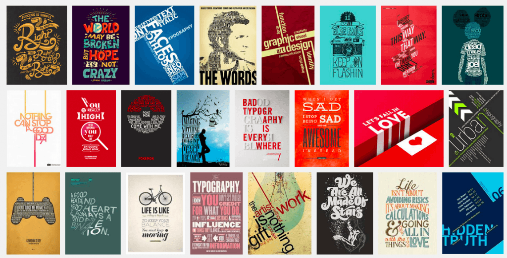
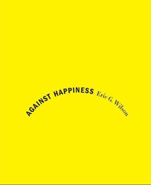
I would want my book cover design to be text based with no illustration so I thought typographic book covers would be the key type of design to look into. I found an article that features 30 typographic book covers which I had a look at for inspiration (here). This article shows me how effective these designs can be and that I can make mine work on a cover like this. There is the option to add shapes to the design to give it something extra, or to completely simplify it and just have text. These designs stood out to me the most from the article:

image9 image14image28image22

Poster

The poster design will most probably be as simple as the book cover design, as it would be an advert of the book. I feel my type would be very effective on a poster as it stands out well with the colour, size and three dimension it has.

Posters “influenced the development of typography because they were meant to be read from a distance and required larger type to be produced influenced the development of typography because they were meant to be read from a distance and required larger type to be produced”

design history

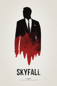
I love minimalist film posters such as these:

29-31-minimalist-posters Brickhut_Ghostbustersskyfall_poster_by_hvejsel-d5pa0cj

I plan on using text only in my poster design, so I’m wondering how well this will work. I might need a small image or to add some kind of shape design to it, but then my typeface might work well on it’s own. After googling ‘typographic posters’ the results all show very busy posters with a lot of text. I don’t know how I would create something similar to this using my typeface, as it might look quite busy/messy. I planned on creating a word or two and displaying it that way, or perhaps just individual letters in a jumble – so it’ll be interesting to see how this works for me.

Typographic Posters on Google