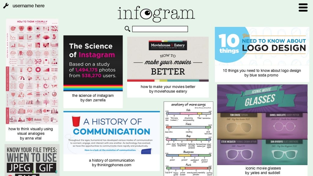
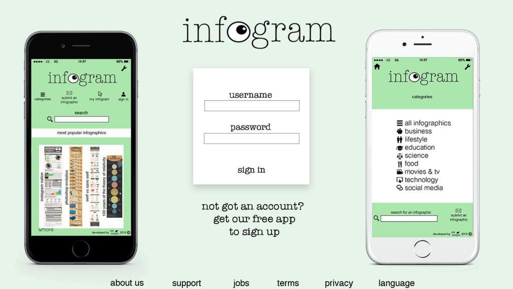
I have made a second page for my website which would appear once users have signed in. I got all the infographics displayed on this page from http://www.coolinfographics.com/. My inspiration here was to create a similar layout to Pinterest to display a variety of infographics across the page.
Category: Final
App Design Improvements
Home page:
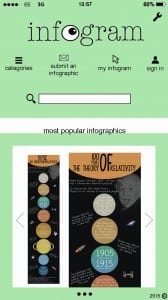 I have overall simplified the home page for the mobile design. I removed the ‘search’ title as I thought the rectangle and magnifier icon made it clear that you can use this tool to search. The ‘most popular’ section has been simplified by only featuring one infographic at a time. There are arrows to show you can flick through the most popular infographics and a symbol below to show you can click to see more. The infographic has been halved to make the information clearer and if a user wanted to see the whole thing they would click the infographic and be taken to the page featuring it.
Infographic page:
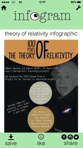 I have also removed a few items from this page including the ‘scroll down’ text and ‘submitted by…’ text.
A2 Poster
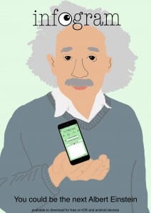
My initial idea for the poster was to do Einstein holding a phone which is presenting the app. I started off by creating an Einstein image by tracing around one I found online.
I wasn’t too sure whether I liked the result of this as it took me ages to get the hand right (and its still not right) but I had a go at using it in the poster design anyway.
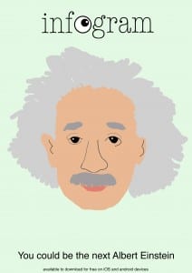
After this I then thought about removing the phone mockup and using just his head. I feel the result of this is simpler but more effective.
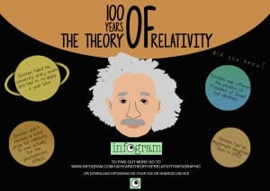
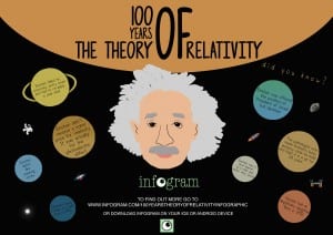
As I wasn’t completely happy with these two designs, I decided to make another poster that features my infographic in some way.
I have then added more to this poster that is already on my infographic:
Infographic Final
This is my final infographic design. A ‘100 years of The Theory of Relativity’ infographic. I am happy with this final design and I feel it does everything I wanted it to when I was first thinking of ideas. It is doesn’t have too much information but still tells you the basics of the theory – making it less confusing and easier to read. My original audience was undergraduates before I started but now I feel it could appeal to a range of ages because of it’s theme of ‘100 years’ celebration. It could appeal to kids who want to know some fun facts on Einstein, teenagers who are studying GCSE science to get an idea on basics of the theory or even undergraduates and postgraduates who know of 2015 being the 100 year point and come across this infographic.
