These are my final designs for the mobile desktop output. I have created a design for an app called ‘Infogram’ – an app that holds thousands of infographics. I have created a home page design which features a ‘most popular’ section with my own infographic. Then there is a menu with several categories that the infographics come under. Then the page where my own infographic is held which I have repeated three times to show a different section of the infographic as the user would have to scroll down the page to see it all. Then I have an icon for the app.
Category: Final
Reflections on my Final Designs for Typography
The typography project has been quite a struggle in ways as I couldn’t really think of an idea. However, since completing the project I have been thinking of other ideas I could have done! Either way, I am happy with what I’ve made even if I do feel improvements can be made. I feel my type would really benefit from me creating the whole alphabet and then maybe turning it into a computer based font.
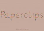
 Although I am happy with the final layout of my typography, I feel this poster appears a little dull. However, I was happy with the colour choice as it was the only one that didn’t really clash with the colours in the type. I feel the colourfulness of the type is an aspect that really works and makes it unique. I found creating this type quite a challenge as I had to photograph every letter I made and then edit them on Photoshop. However, although there is definitely improvement to be made there, I feel every letter has similarity in shape and style. I feel that if the editing process wasn’t so long winded I would have happily created the whole alphabet. I probably could of anyway but the letters wouldn’t have been to my almost perfectionist standard. I found myself using the eraser tool on background image that the ‘colour range’ tool did not pick up. If I did this on every letter of the alphabet it would have gotten tedious.
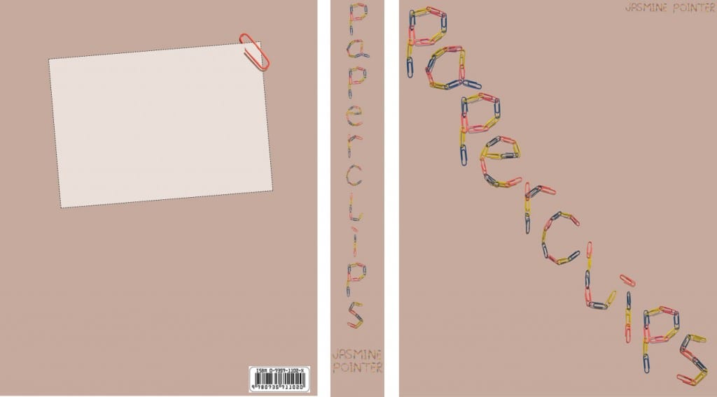
I also presented my type on a book cover which I think works well – I didn’t need much else going on on the front cover as the type has a lot going for it on it’s own. I made a little back page too but left it blank.
Doing this project has sparked an interest in typography and creating my own typefaces. After completing this project and the next I might have a go at doing this again with some of my other ideas I have in mind. I would like to create my own working font.
Final Design: Poster
After having a play around with my book cover design on Photoshop, I decided I didn’t completely like the layout and the way it looks as a book cover. Therefore I decided to display it as a landscape poster as I thought the type would look better this way. The poster could be advertising the book – so my two designs work well as a package.
Final Design: Typographic Book Cover
I decided to present my typeface on a typographic book cover design. As the type was made up with paperclips I thought the most obvious title for the book would be that.
I kept the cover simple using text only as I have seen others like it that were really effective and wanted to try it myself. The typeface has a lot going on anyway so I felt it would be too crowded with other images.
The main issue I had was deciding on a background colour that didn’t clash with the colours of the paperclips but I feel this beige/pink colour works well. I’ve included my name where the author name would be and to also include some uppercase lettering of my type. However, I think that it would have been better in another font to keep the attention on the main title. Keeping the shadows around the paperclips was a good idea as now it gives it a 3D look and really makes them stand out.
I’ve also designed the spine of the book and the back cover, which is a basic layout for information such as the blurb, publisher, etc to be added to. I felt I needed to include this in the design to show it clearly as a book cover design.


