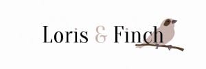
I am happy with my typeface choice for my logo – Oranienbaum by Jovanny Lemonad – as I feel it looks sophisticated and the ampersand has a really good effect as it stands out and holds character. I feel all of these aspects are important for the company as it aims at customers of an upper middle class background and it specialises in old or character properties. In order to get the logo how I want it I will need to tweak this font on Photoshop in terms of height, width, kerning, and so on.
My next step is to choose colours and add some imagery as I have found that a logotype may appear too dull or mainstream, and I want the company to stick out from other estate agents as it has it’s specialities rather than just working with all types of properties and people.
My first thought was to add a tree to the design, this being because most character properties are found in the countryside, or with big gardens, etc. but after a few attempts of drawing one on a graphics tablet I decided against this.
I then turned to the name itself and how I could portray it in imagery. This left me with adding an image of a loris or a finch. I felt that a finch appears a lot more sophisticated, and most importantly, British. Therefore I went down this route.
Using a graphics tablet and an existing image of a finch, I traced and created this:
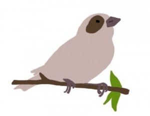 I also created a version without the leaves as I wasn’t sure about the extra colour. The colours came from using the eyedropper tool on an existing image of a finch, which I then tweaked to give more emphasis and to make them all match well. I thought that from these colours I can then create the companies colour palette.
Knowing my typeface and having an image to use I put them together on Photoshop:
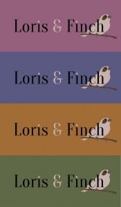
 With this I incorporated the colours from the image into the text. I prefer the image without the leaves so decided to work with this one further to come up with a background colour and the main colour the company would be associated with.
Colour Ideas
From these I prefer the green as I think the top two are perhaps too feminine and I wanted a mix. The orange works well but I think the company is able to relate to the colour green by how it focuses on character properties (which often have green gardens). It also focuses on old buildings but I also feel the green has a classy look that the orange doesn’t and makes it look quite high-end.
With this colour in mind I decided to re-arrange the layout of the logo to see what else I could come up with.
I started by tweaking the finch drawing to perfect the edges and give it an outline that will make it stand out.
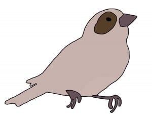 I also took away the branch as I wanted to place the finch on the lettering itself.
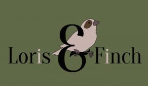
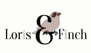 I decided to take away the green background momentarily and work on a different layout. After adjusting the lettering many times, trying different angles, adding and removing shapes, simplifying it and more, I came to this:
In this layout I really like the way the finch sits on the ampersand so well. It causes a central point for the logo and draws your attention to it. I used the pale pink colour within the lettering but I am still undecided on this as well as the black. I am now also undecided about the colour of the background, and I have come up with another selection of greens/blues and one red/brown that I liked:
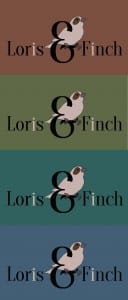 In order to decide on which colour to choose I plan on asking different people’s opinions and finding the popular choice. From there I can go on to put the logo to use.
After asking around 10 people, including other members of my group, I found that the second option is the most popular choice, with the bottom two close behind. I am going to go with the second option as the final logo which gives me the companies colour palette.
