Infographics

I have been doing some research into infographics so I could get some inspiration and ideas flowing. I’ve been looking at examples on www.customermagnetism.com/infographics/ which has a variety of different infographics to show.

what-is-an-infographicI liked this one as it proved to me how effective infographics are by explaining very clearly what they are. I  like the design and how it continues down the page – it shows that infographics can be very flexible in this  way and don’t need to be a set size. The information displayed is minimal and yet useful – which shows me that I don’t need to go completely in depth with it. I can include quotes, statistics (displayed as graphs, charts, through imagery, etc), colour and images. I do like the style of this infographics, which has been presented in a grid fashion, but I think I would like mine to be less precise in this way. I will try grids but I would rather not use this layout. I have a colour scheme in mind, which I can see from this infographic is important to keep a balance and make the vast amount of information easier to read and comprehend.

I also had a look on this website – www.informationisbeautiful.net which gave me a good insight into different ways of displaying information so that it is visually pleasing but also how to make it interactive. For example: ‘Non-Fiction Books Everyone Should Read’ – this infographic names different book titles in a creative design and when you click on each title it leads you to a website where you can buy it. I won’t be able to do this myself, but I can always explain what the infographic would be like when online.

Existing ‘Theory of Relativity’ Infographics

I had a look at what infographics for the theory of relativity are already out there to see how I could make mine different but also to get some inspiration and knowledge. After googling ‘theory of relativity infographics’ I was soon able to pick out which I liked and disliked –

relativity-how-it-works-150304e-02I really liked this infographic (<— click), which helped to explain the theory to me. It’s got a lot going on visually but in a good way that keeps you interested. I feel like the length of the infographic helps to spread out the information. As you cannot see it all at once it breaks it up a lot more and makes it simpler for the audience. The layout is split into sections which I like, but I also want to have a go and mixing the layout around and overlapping sections to see how this would look too.

theory-relativity

I both like and dislike this infographic. I do like how you can see all of the infographic on your screen without scrolling down or across because it helps to show off the overall design involved such as the colour scheme. However, the colour scheme is one of the things I don’t like. It’s too dull in my opinion and the typeface used is very boring. I think this infographic was probably made for an older target audience and perhaps someone who is very interested in the subject, perhaps a physics student. It’s not the kind of style I would use in my own.

media_relativity

I can definitely say I don’t like this one as its just too plain and boring. The typeface is plain, simple, boring and dull. There is not a lot going on visually with very basic images. The colours do not allow anything to stand out. It makes the information as boring as the way it is presented which is not what an infographic should do.

Looking at these infographics has given me a good idea of what I want to do and what I definitely do not want to do. Now I need to research more into the theory itself so I know what information to present.

Project Two: Multi Format Data Visualisation

As project two is all about presenting Einstein’s theory of relativity on different platforms, I thought I should begin by looking up on what it actually is…

Albert Einstein, in his theory of special relativity, determined that the laws of physics are the same for all non-accelerating observers, and he showed that the speed of light within a vacuum is the same no matter the speed at which an observer travels.

Space.com

In Einstein’s general theory of relativity, space and time become even more flexible. “Your mileage may vary,” and so may the time intervals you measure, depending on where and when you are.

einstein-online.info

E = mc 2


Audience:

In terms of the audience for the specific content I want to create, the visuals I have in mind would suit a younger audience, perhaps primary school around year three and four. Therefore I’ve looked at websites for kids that explain the theory of relativity to see how they present it.

http://www.ducksters.com/science/physics/theory_of_relativity.php

http://www.kids.esdb.bg/einstein.html

The ones I’ve found are pretty awful. They’re dull, plain and simple (very web 1.0). Although they’re trying to be interesting and appealing to kids with the use of colour, they’re just not. If I was a kid looking at this in order to learn about the theory of relativity, I would be very bored and un-interested.

I also feel like my ideas could also appeal to teenagers for a GCSE or maybe undergraduate students. I’m thinking of having cartoon style images so the depth of information will determine whether it suits a primary school children audience or 15-19 year olds.

Research: Book & Poster Design

I have already presented my typeface using a PSD mock-up but once I improve my design and complete it, I would like to present it on a book cover/poster, therefore I have been doing some research into book/poster design which relates specifically to my own ideas.

Books

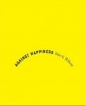
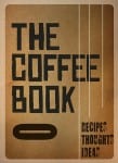
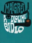
I would want my book cover design to be text based with no illustration so I thought typographic book covers would be the key type of design to look into. I found an article that features 30 typographic book covers which I had a look at for inspiration (here). This article shows me how effective these designs can be and that I can make mine work on a cover like this. There is the option to add shapes to the design to give it something extra, or to completely simplify it and just have text. These designs stood out to me the most from the article:

image9 image14image28image22

Poster

The poster design will most probably be as simple as the book cover design, as it would be an advert of the book. I feel my type would be very effective on a poster as it stands out well with the colour, size and three dimension it has.

Posters “influenced the development of typography because they were meant to be read from a distance and required larger type to be produced influenced the development of typography because they were meant to be read from a distance and required larger type to be produced”

design history

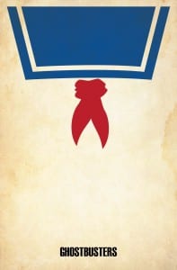
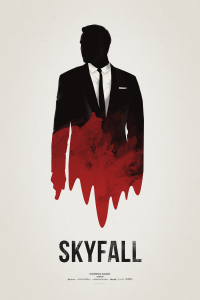
I love minimalist film posters such as these:

29-31-minimalist-posters Brickhut_Ghostbustersskyfall_poster_by_hvejsel-d5pa0cj

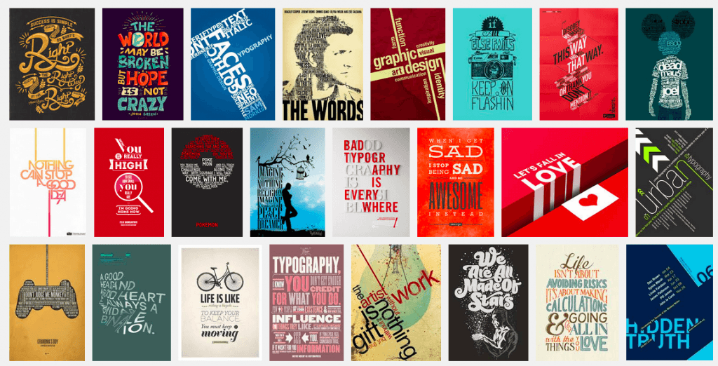
I plan on using text only in my poster design, so I’m wondering how well this will work. I might need a small image or to add some kind of shape design to it, but then my typeface might work well on it’s own. After googling ‘typographic posters’ the results all show very busy posters with a lot of text. I don’t know how I would create something similar to this using my typeface, as it might look quite busy/messy. I planned on creating a word or two and displaying it that way, or perhaps just individual letters in a jumble – so it’ll be interesting to see how this works for me.

Typographic Posters on Google

Everyday Type

Screen Shot 2015-10-14 at 15.59.30


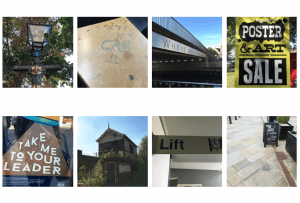
It’s interesting to focus on the type that surrounds you day-to-day. Before doing this project this is something I’d not really thought about, but now its hard not to. I found a range of different type, some boring (the lift sigh) and some interesting (the ‘city of lincoln’ written on the lampost). This was a good exercise to get my mind focusing on typography.

Thinking with Type

Letter Anatomy:

Anatomy

 Sketch 1

Sketch

Although my first attempt at drawing out the letters was really poor, I enjoyed doing this and found it interesting learning all the ins and outs of letters from cap-height to baseline (which I should have made the effort to draw out as a guide). I looked this up on thinkingwithtype.com.

Doing this has made me consider sketching my own typeface for the project, which I had ruled out before because I thought I’d be rubbish at it. My only problem would be coming up with an original idea.

I also had a go and sans serif fonts which I think turned out well.


Typeface Design:

I found this section called ‘typeface design’ on thinkingwithtype which I read through and I found the following questions particularly useful when thinking about what I want to do for my typeface.

Will the letters be serif or sans serif?

I think I want to create a sans serif typeface, but I’ll experiment with both.

Will you construct them geometrically or base them on handwriting?

I’d like to create a typeface with a script-like feel to it, or maybe base it on my handwriting. But I’m also interested in maybe creating one digitally or using objects to form letters. 

Will you work with historic source material or invent the characters more or less from scratch?

I will probably create them from scratch as that’s just the way I seem to work in general. By playing around with either sketching, adobe illustrator or different objects to create my typeface I should come up with something that I like.


Typeface or font?

Something that I found interesting whilst scrolling through the website was a section called ‘typeface or font’ as this is a question I am often asking myself. I always used to think that ‘font’ was a term that came from fonts on computers, but font just generally means “the delivery mechanism” of the letterforms. I find this defined it very clearly and will help in my future use of the words and within this project.

A typeface is the design of the letterforms; a font is the delivery mechanism. In metal type, the design is embodied in the punches from which molds are made. A font consists of the cast metal printing types. In digital systems, the typeface is the visual design, while the font is the software that allows you to install, access, and output the design. A single typeface might be available in several font formats. In part because the design of digital typefaces and the production of fonts are so fluidly linked today, most people use the terms interchangeably.