Mockups

In today’s workshop I added my existing typeface to a PSD mockup to see what my type would look like when used in a design. With the only letters I’ve created so far I made this:

mockup-jamI’m not quite sure how I feel about this presentation. I will be looking into other ways I can present my typeface in order to showcase it well, such as on a poster or book cover. I will create more letters so I’m able to present the type with more thought.


Work In Progress

After deciding I wanted to create a type by hand out of physical objects, I then sat down to think up some ideas. I came up with a few ideas for objects I could use including feathers, pencils, paper clips, paper shreds or leaves. I decided to go with paper clips and had a go at attaching several together and shaping them into letters. This is what I got:

With this I decided it was too basic and therefore I transferred the images to Photoshop to turn them into letters for fonts.

I did this by removing the background of the images, leaving the paper clips, with the background eraser tool. This made them look a lot more appealing and it allowed them to stand out. This is the result:


I think in order to appreciate the style of this type I will need to create the whole alphabet but editing them has made a good difference. I will be editing them further to perfect them (the editing is patchy and needs sorting) and I also want to play around to see what changes I can make to them.

Everyday Type

Screen Shot 2015-10-14 at 15.59.30


It’s interesting to focus on the type that surrounds you day-to-day. Before doing this project this is something I’d not really thought about, but now its hard not to. I found a range of different type, some boring (the lift sigh) and some interesting (the ‘city of lincoln’ written on the lampost). This was a good exercise to get my mind focusing on typography.

Thinking with Type

Letter Anatomy:

Anatomy

 Sketch 1

Sketch

Although my first attempt at drawing out the letters was really poor, I enjoyed doing this and found it interesting learning all the ins and outs of letters from cap-height to baseline (which I should have made the effort to draw out as a guide). I looked this up on thinkingwithtype.com.

Doing this has made me consider sketching my own typeface for the project, which I had ruled out before because I thought I’d be rubbish at it. My only problem would be coming up with an original idea.

I also had a go and sans serif fonts which I think turned out well.


Typeface Design:

I found this section called ‘typeface design’ on thinkingwithtype which I read through and I found the following questions particularly useful when thinking about what I want to do for my typeface.

Will the letters be serif or sans serif?

I think I want to create a sans serif typeface, but I’ll experiment with both.

Will you construct them geometrically or base them on handwriting?

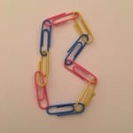
I’d like to create a typeface with a script-like feel to it, or maybe base it on my handwriting. But I’m also interested in maybe creating one digitally or using objects to form letters. 

Will you work with historic source material or invent the characters more or less from scratch?

I will probably create them from scratch as that’s just the way I seem to work in general. By playing around with either sketching, adobe illustrator or different objects to create my typeface I should come up with something that I like.


Typeface or font?

Something that I found interesting whilst scrolling through the website was a section called ‘typeface or font’ as this is a question I am often asking myself. I always used to think that ‘font’ was a term that came from fonts on computers, but font just generally means “the delivery mechanism” of the letterforms. I find this defined it very clearly and will help in my future use of the words and within this project.

A typeface is the design of the letterforms; a font is the delivery mechanism. In metal type, the design is embodied in the punches from which molds are made. A font consists of the cast metal printing types. In digital systems, the typeface is the visual design, while the font is the software that allows you to install, access, and output the design. A single typeface might be available in several font formats. In part because the design of digital typefaces and the production of fonts are so fluidly linked today, most people use the terms interchangeably.


Modernism

International Typographical Style: Modernism Lecture

Todays lecture talked a lot about Helvetica and the varied views different designers have on it. I’ve always looked at Helvetica to be a plain, simple and dull typeface. However, after seeing the work of Josef Muller Brockmann, I changed my mind.

  • beethovenHis design is so simple yet effective by the way he has used Helvetica. He uses no uppercase lettering which creates a certain style and image. The way that ‘beethoven’ has not been made a big deal for example, by blowing it up, it has drawn more attention to it. The background design also draws attention to it by the way it is shaped. I love the clarity of this poster and it’s minimalism is refreshing.

Josef Mullar Brockmann, 1955, ‘Beethoven’

We also watched an extract from ‘Massimo Viginelli: Film Helvetica’. Viginelli explains how he disagrees that type should be expressive and this is why he likes Helvetica. However, I disagree with him as I feel that, especially with the range of type there is these days, all type is expressive and has a certain effect on a design.

However I do like what Brockmann has done with his design and I think I will try to incorporate my own typeface into a minimalist design like this to see if I can create a similar effect.