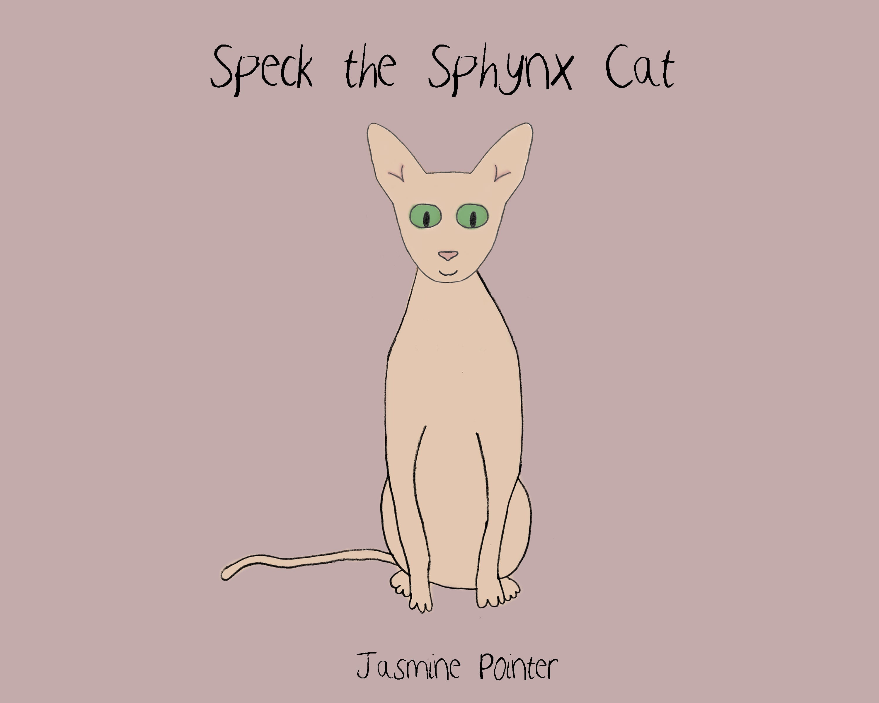
Although at this point I do have a finished edition of ‘Speck the Sphynx Cat’, I feel there are improvements to be made including:
- Page Layout – needs to be more consistent in terms of text placement
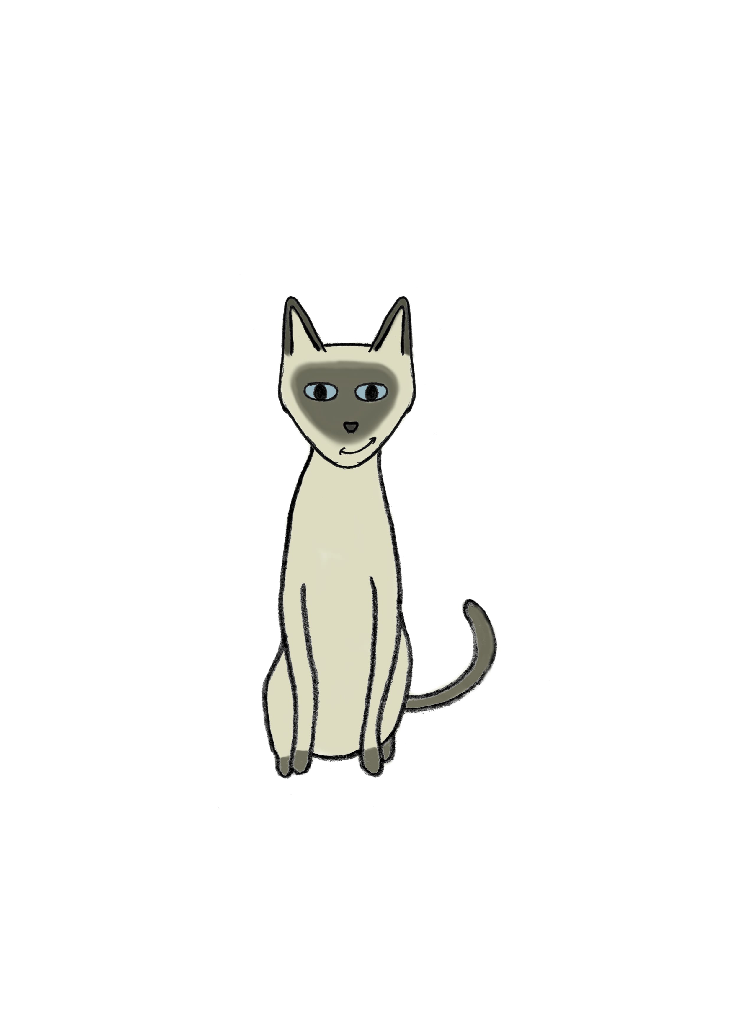
- Illustrations – there are some that I am not 100% happy with and would like to try altering. I also feel that perhaps some characters have an odd sort of style that doesn’t blend with the style of the others. They are all hand drawn and then digitally painted/coloured, however the siamese and the black cat seem too ‘cat like’ and less anthropomorphic than the others.
- Front/Back cover – at this point not a lot of thought has gone into these, so I’d like to look at them and see what else I can do with them. As they are now, they seem quite blank.
I have also decided at this point to use the book which uses the font ‘Verdana’ rather than the one which uses my custom made font. However, I am thinking of using my own font (named ‘Speck’) within the speech bubbles. I may need to alter my font slightly.
Whilst browsing Google for picture books recently, I also came across a book called ‘Don’t Let the Pigeon Drive the Bus’ by Mo Willems. It stood out to me because of its front cover:
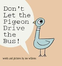 The style of the illustrations and page layout is quite similar to my own – with the hand drawn character, the use of speech bubbles, the different colours on each page and the simplicity of whats on the page. Seeing this has allowed me to see the potential of my own book. I feel that in places there are pages that are quite cramped and busy in terms of the text layout, but now I can see that simple works too. I will use this book as my inspiration from here on to finalise my design.
 The audience feedback I have received for ‘Speck the Sphynx Cat’ so far has been very positive with people saying that their children really enjoyed the book. This helps me to realise that my story works well and children are understanding the message it gives and creating a liking for the characters. I just need to perfect and complete my overall design, and then I feel will be happy with the result.


