 I’ve started on the main character of the book, “Speck”.
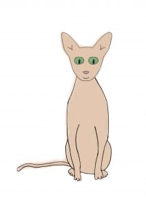
At first, I found a photo of a sphynx cat from Google and started to trace it using colour brushes on Photoshop. However, I realised I’m not the best at this and it just did not look right. May be if I worked on it a bit more it would have turned out fine, but I decided this isn’t the look I want.
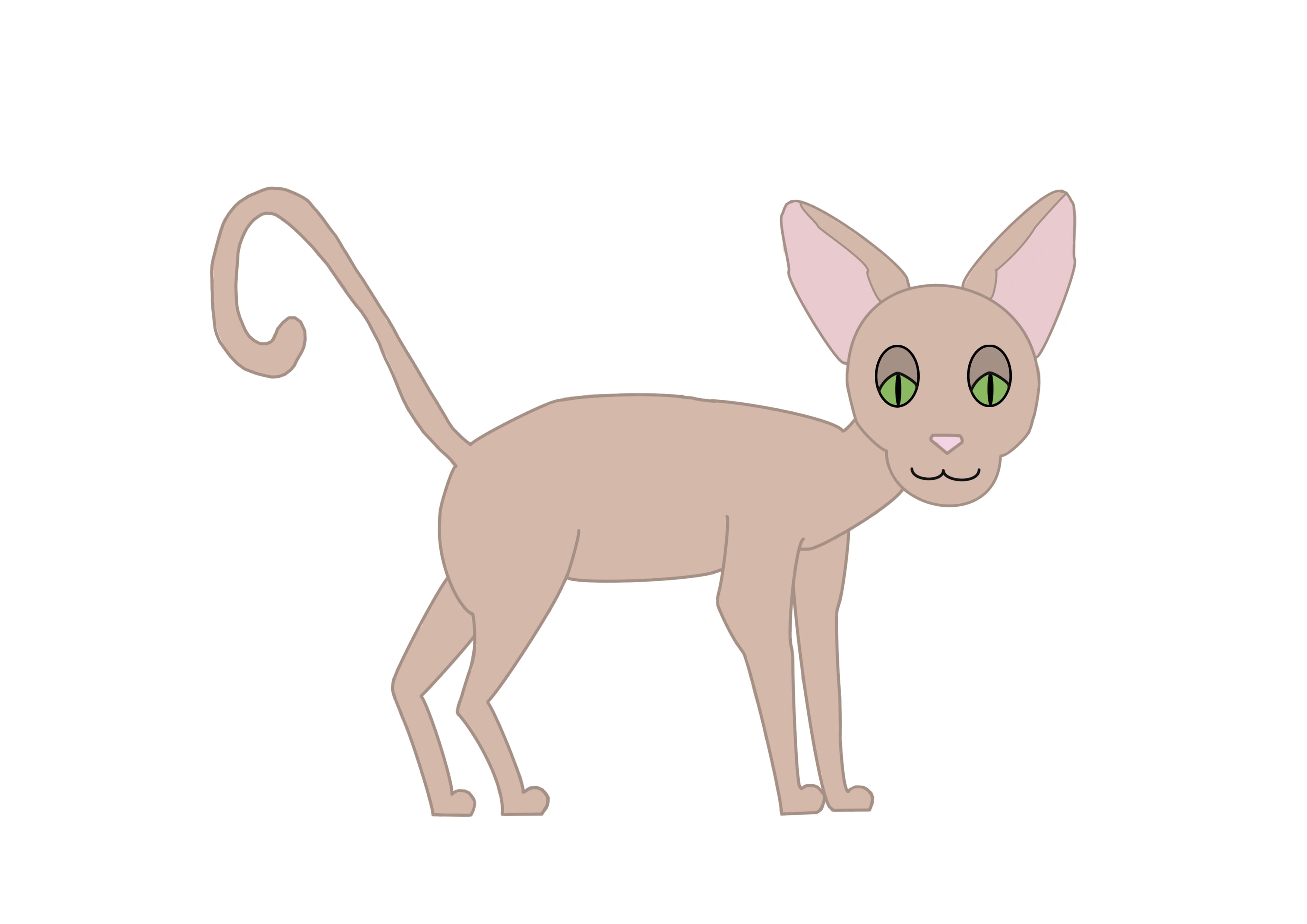
I then tried to create him on photoshop with the brush tool. However, I decided against these illustrations as I felt they weren’t they right look and I wanted to start with a new visual idea in mind. These are too ‘perfect’ as in the outline is neat and the painting is blocked and inside the lines.
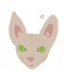
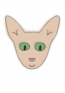
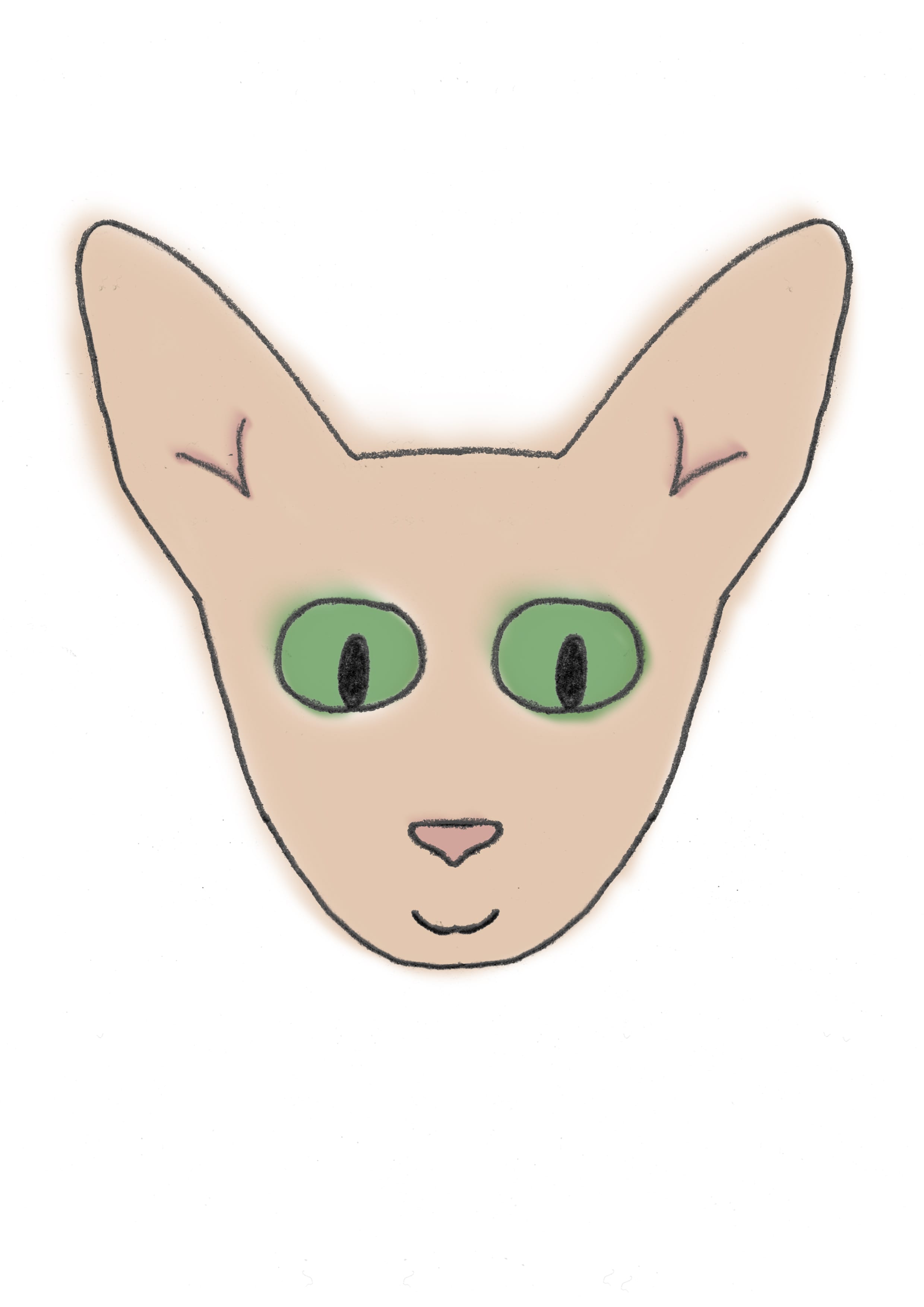
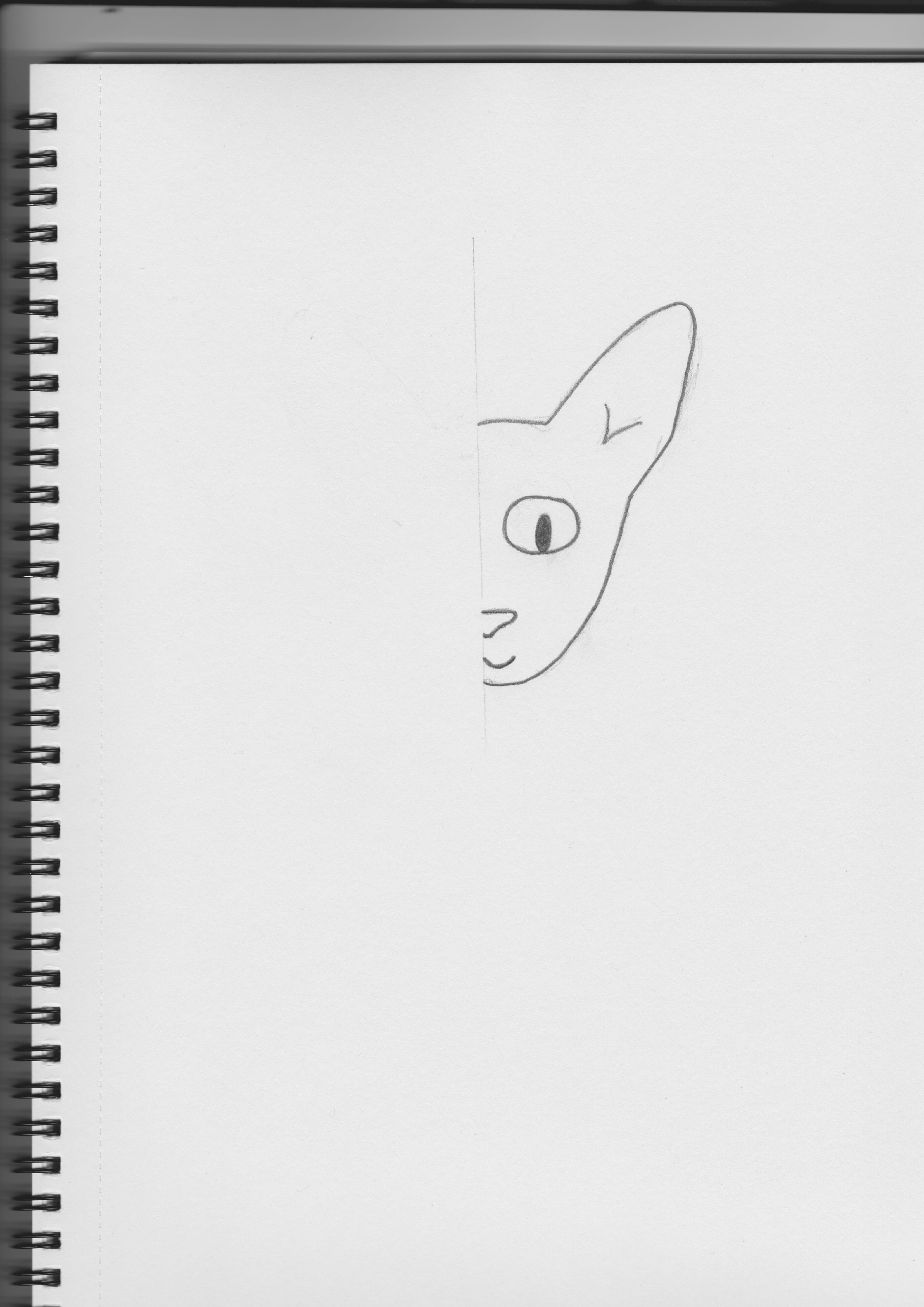
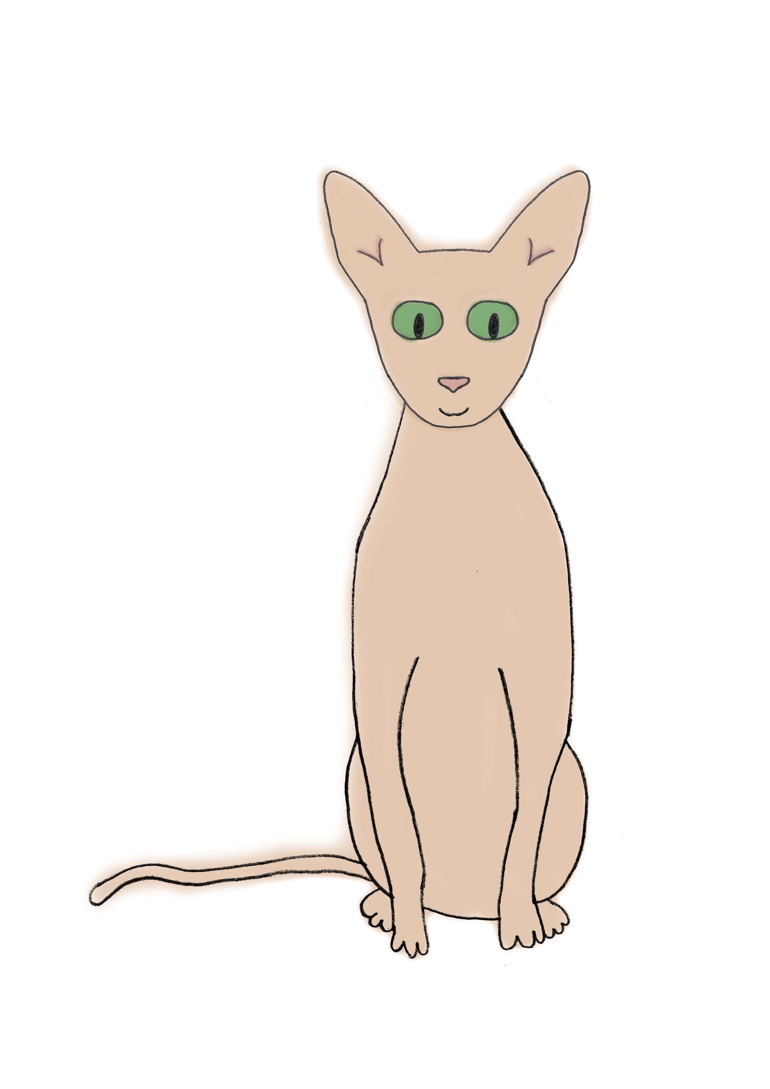
 I have decided I would like a sketched, watercolour look. I wanted to achieve this by hand-sketching the outline and then painting it with a watercolour style brush on photoshop with a graphics tablet. I am happy with the basic outline of the face that I have created for Speck, to be used throughout the book. I am unsure on the look of the style of the painting which is done on photoshop so far. I might try water paints by hand and see how this looks. I have found it difficult to get the eyes right which is why I have struggled in creating him so far, with this sketch I might try other eyes as I feel the first ones are too much like the ones in “I Want My Hat Back” by Jon Klassen, but I like them. The second eyes I made digitally so they stand out too much and may be don’t suit the character as much.
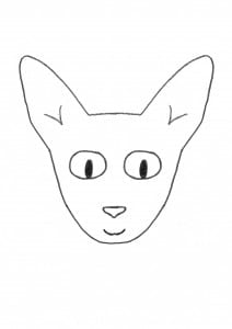
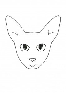
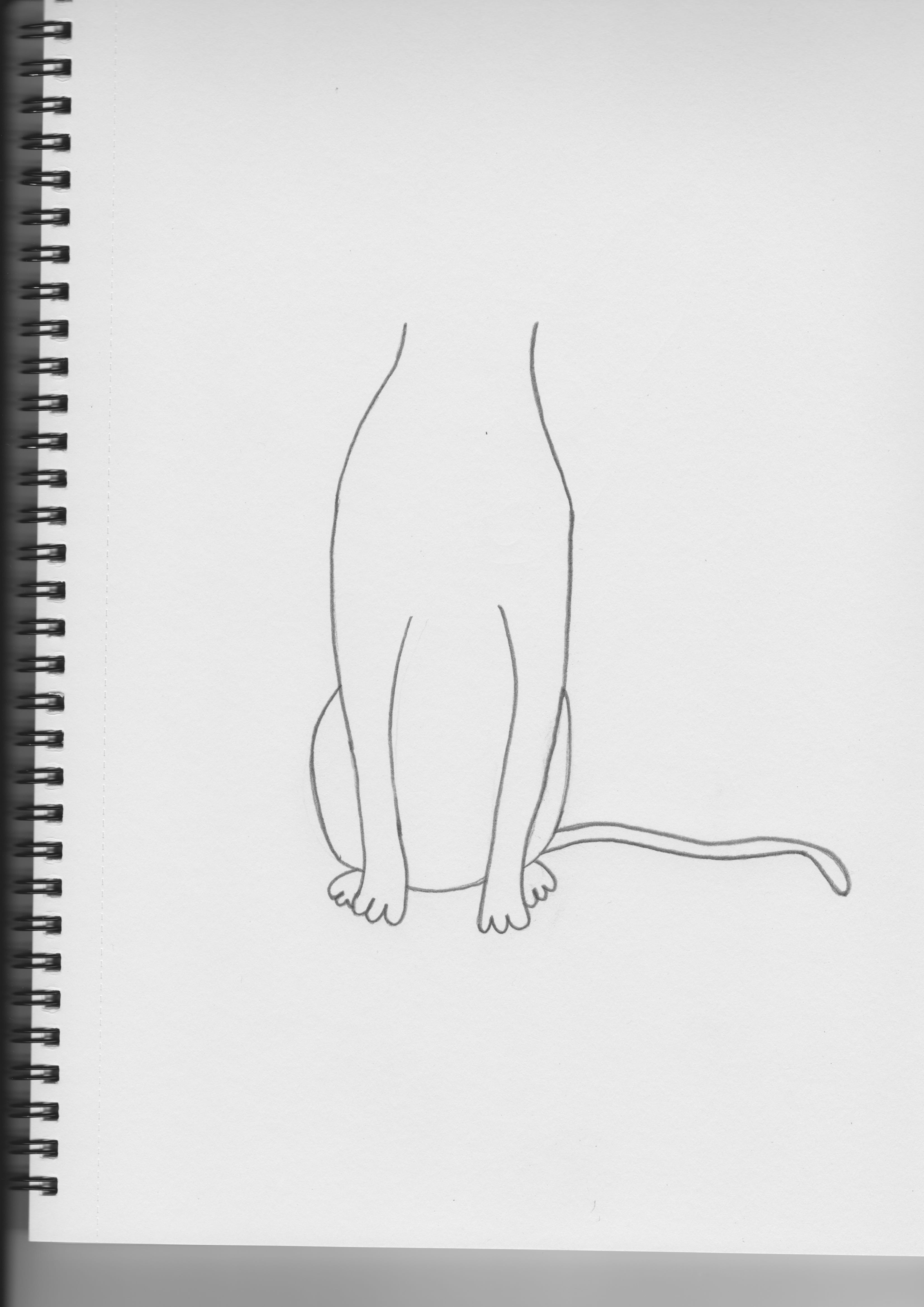
Initial Sketches:

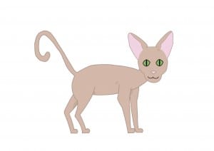
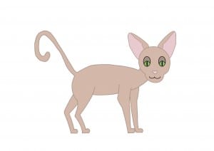
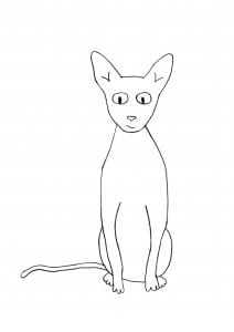
Full body Speck:


