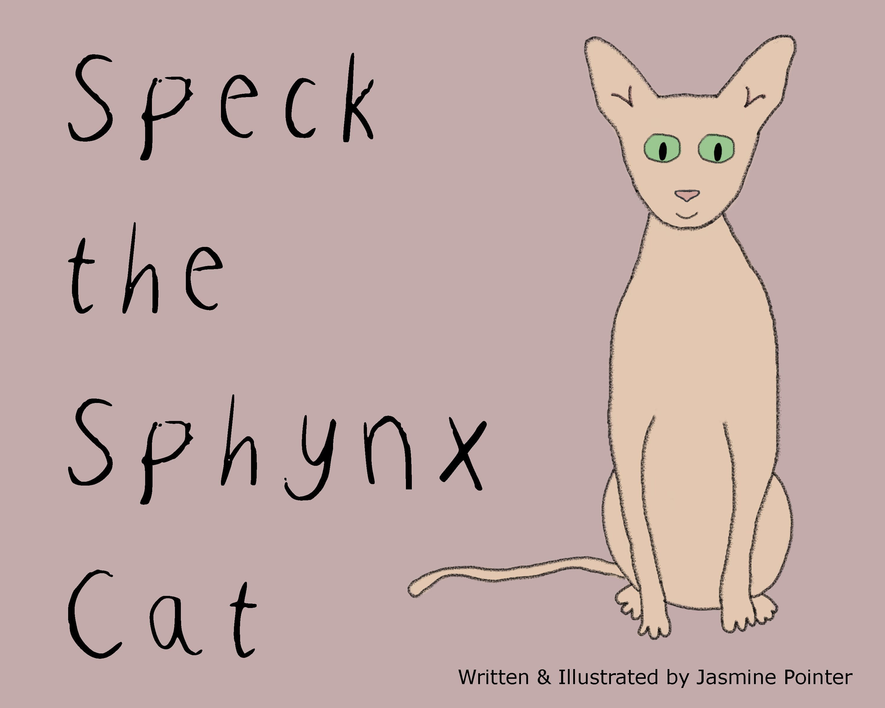
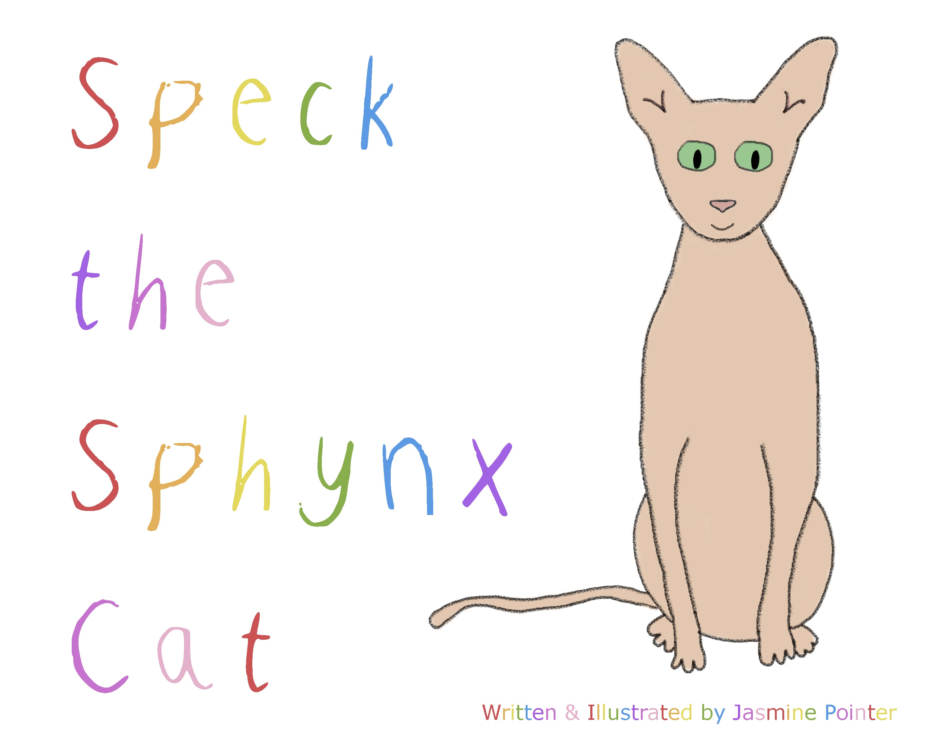
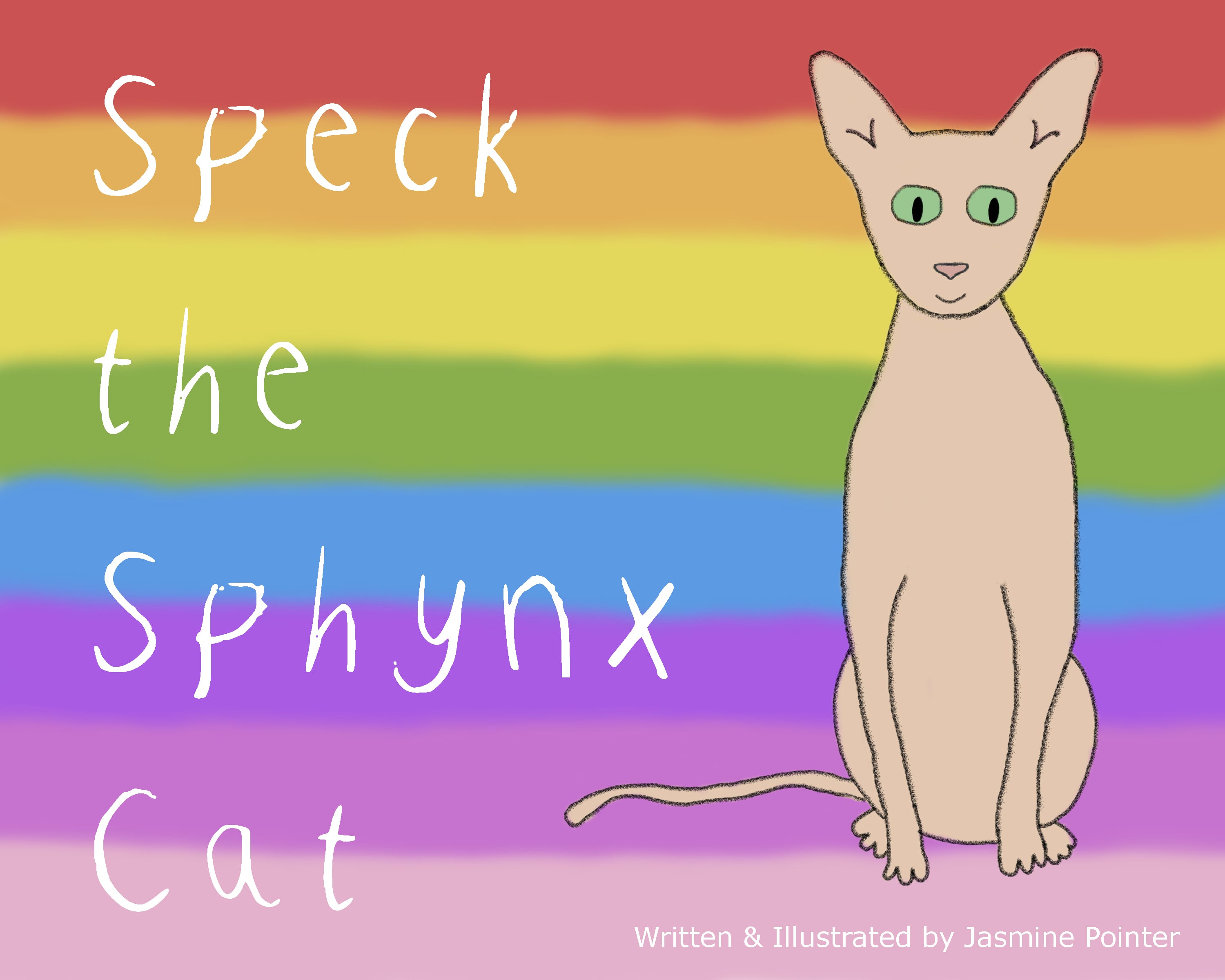
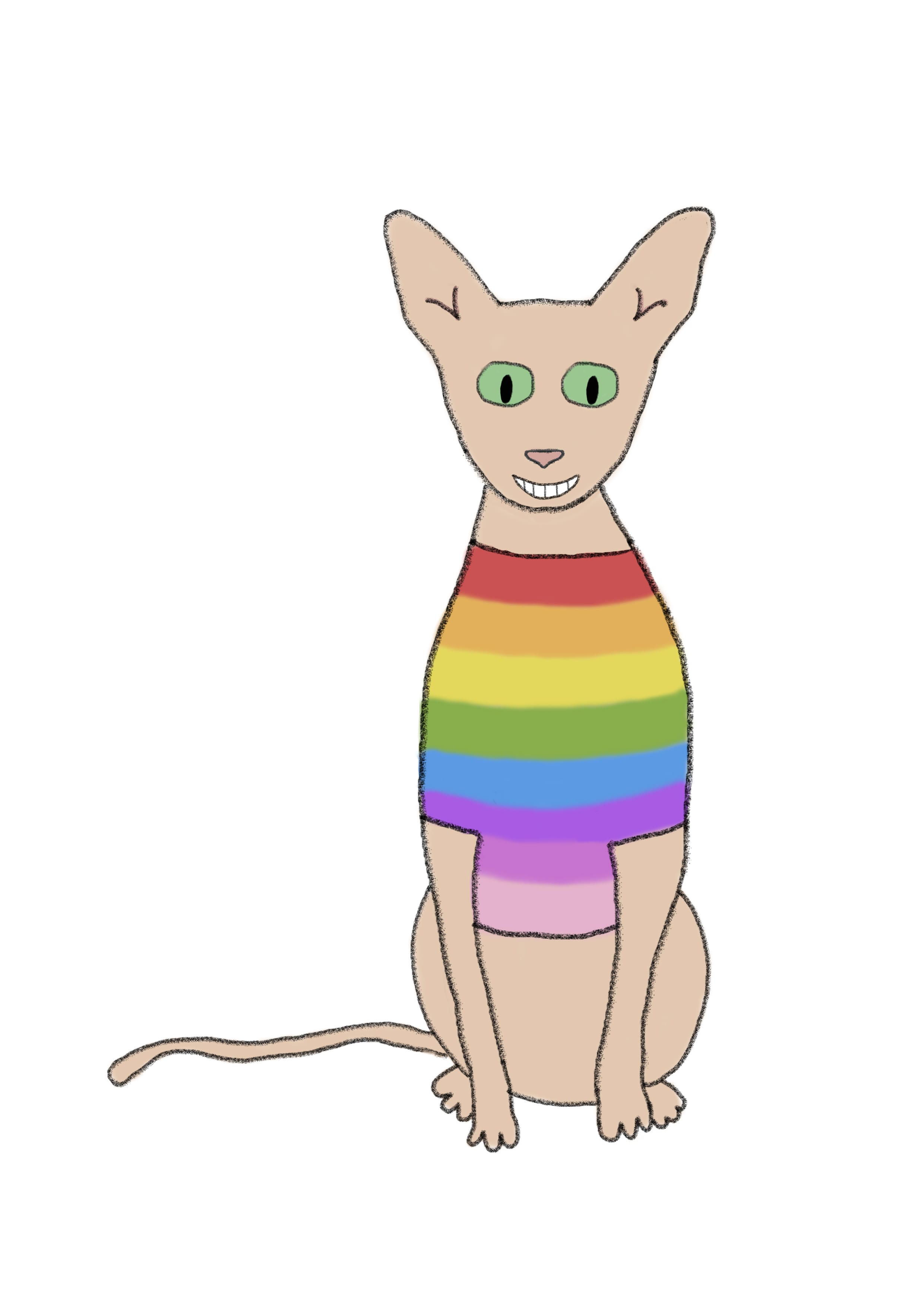
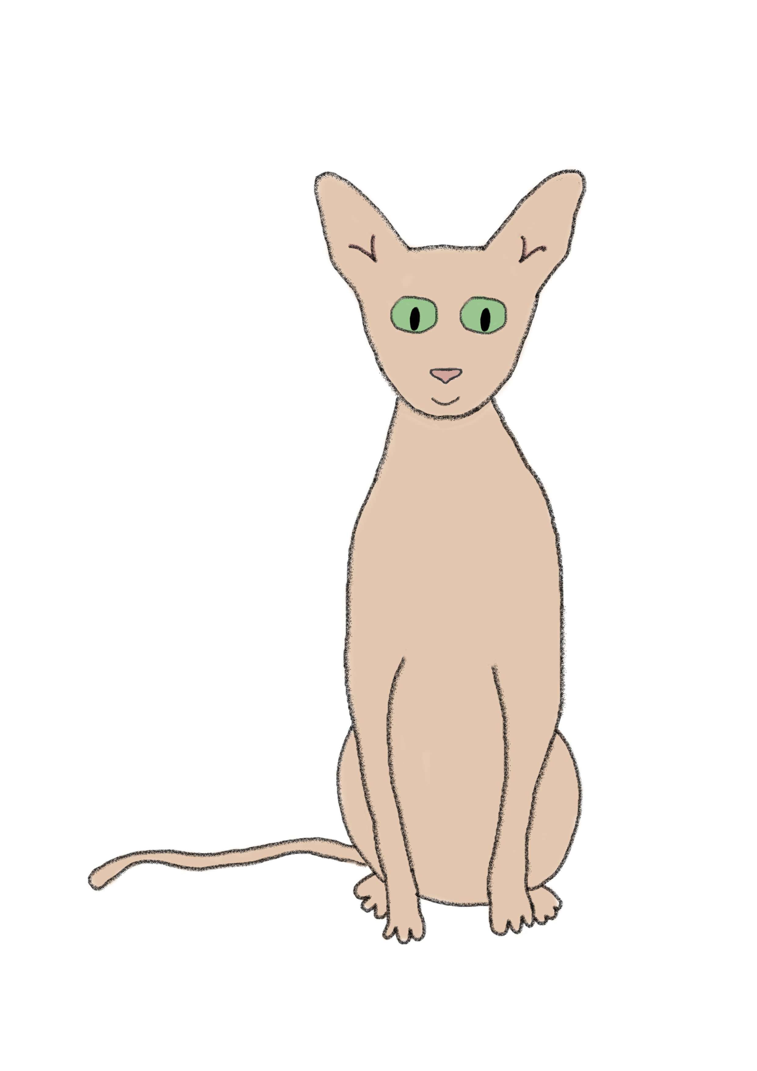
At the end of this project, I have been reflecting on my picture book as it stands now. I feel that it has come a long way and become much more fun, bright and exciting. My original design felt quite dull and the original jumper that Speck wore had no distinctive feature, but I improved this to connect the design of the book to the jumper itself which gives the book more of an identity:
Before:
 After:
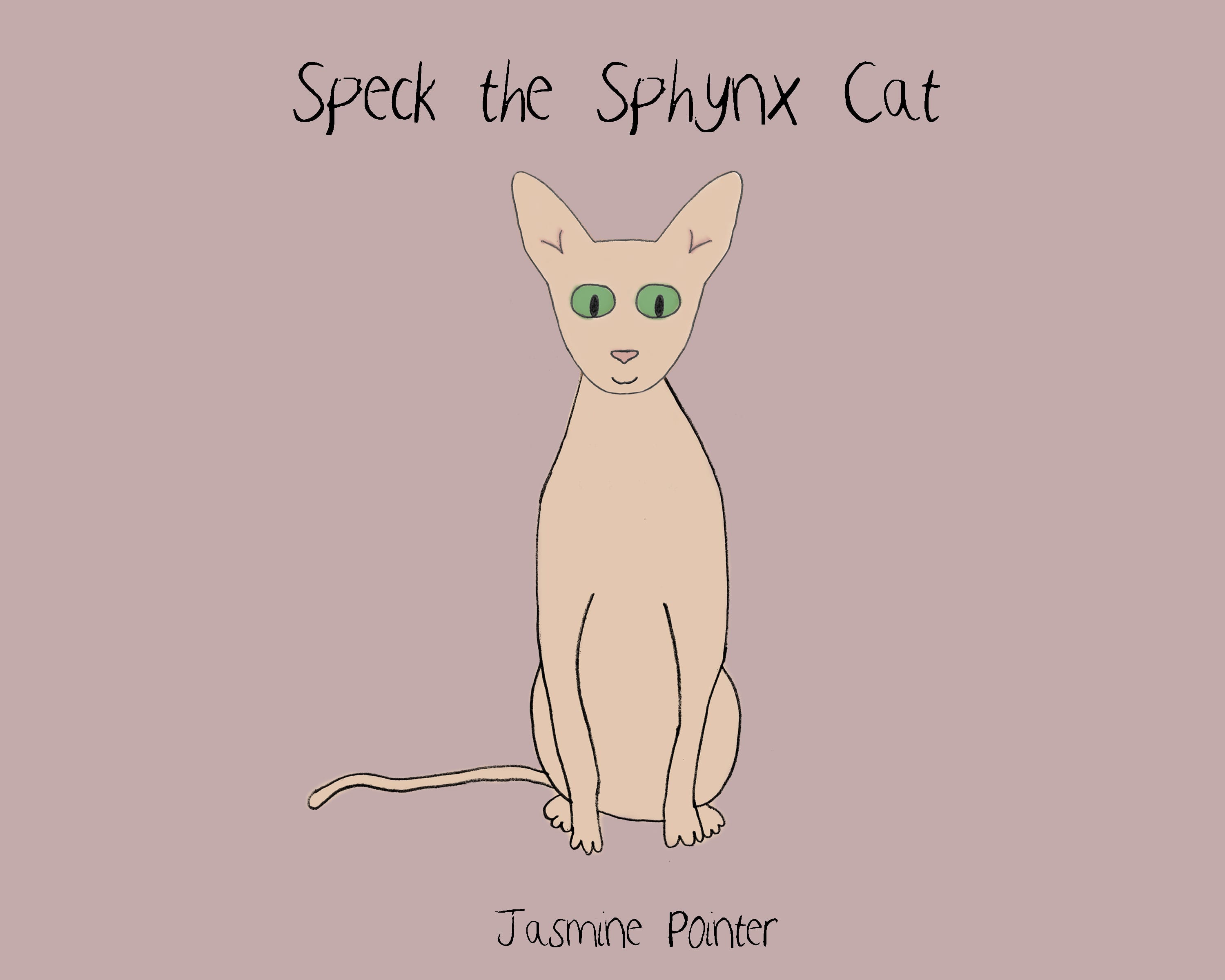
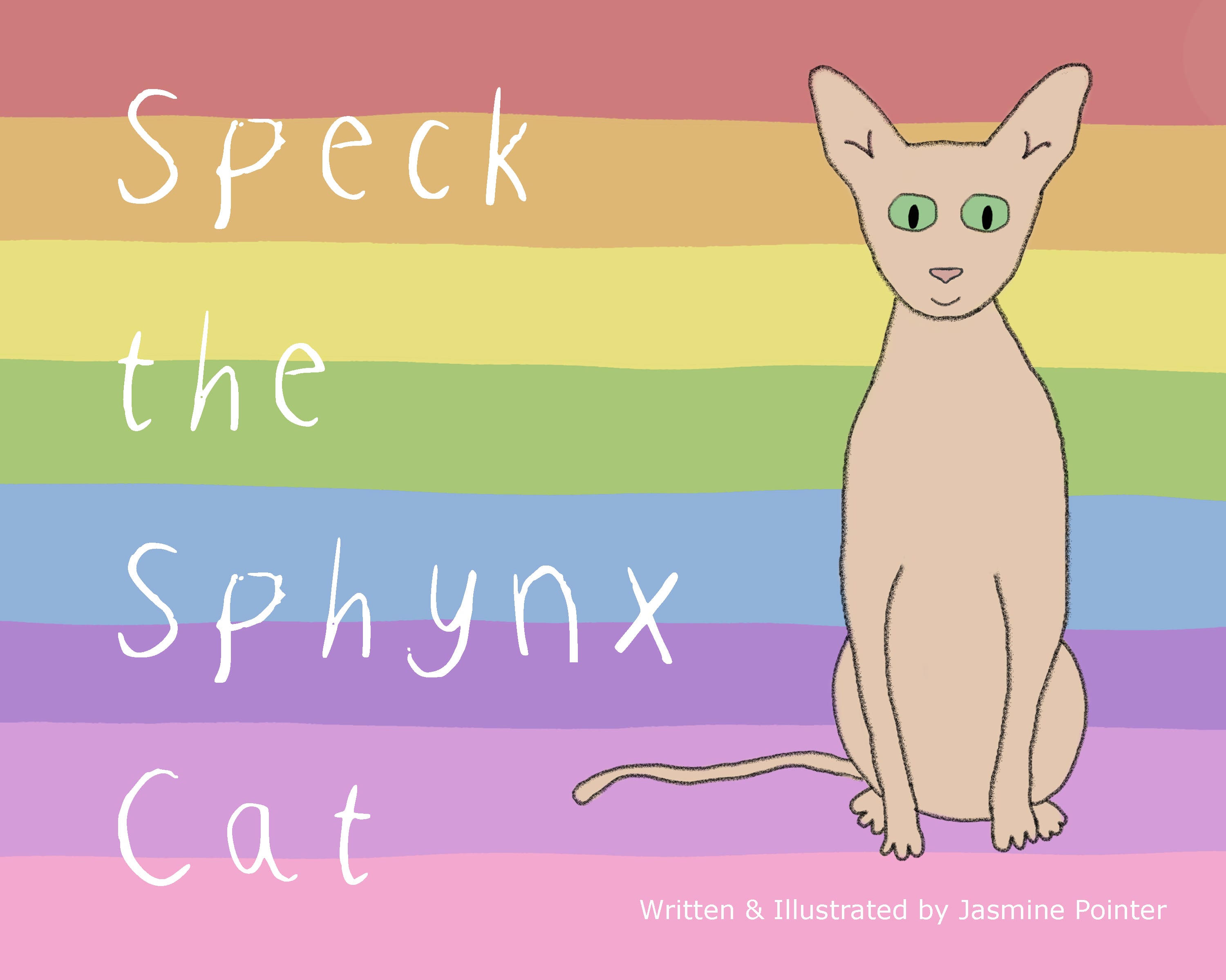
 The creation of the character Speck initially took a lot of time as I couldn’t quite find the right style for him, but I am happy with the final result. He looks friendly and likeable, which is important for the main character of a children’s book. The style is hand-drawn/sketch which I think works well in the overall look of the book.
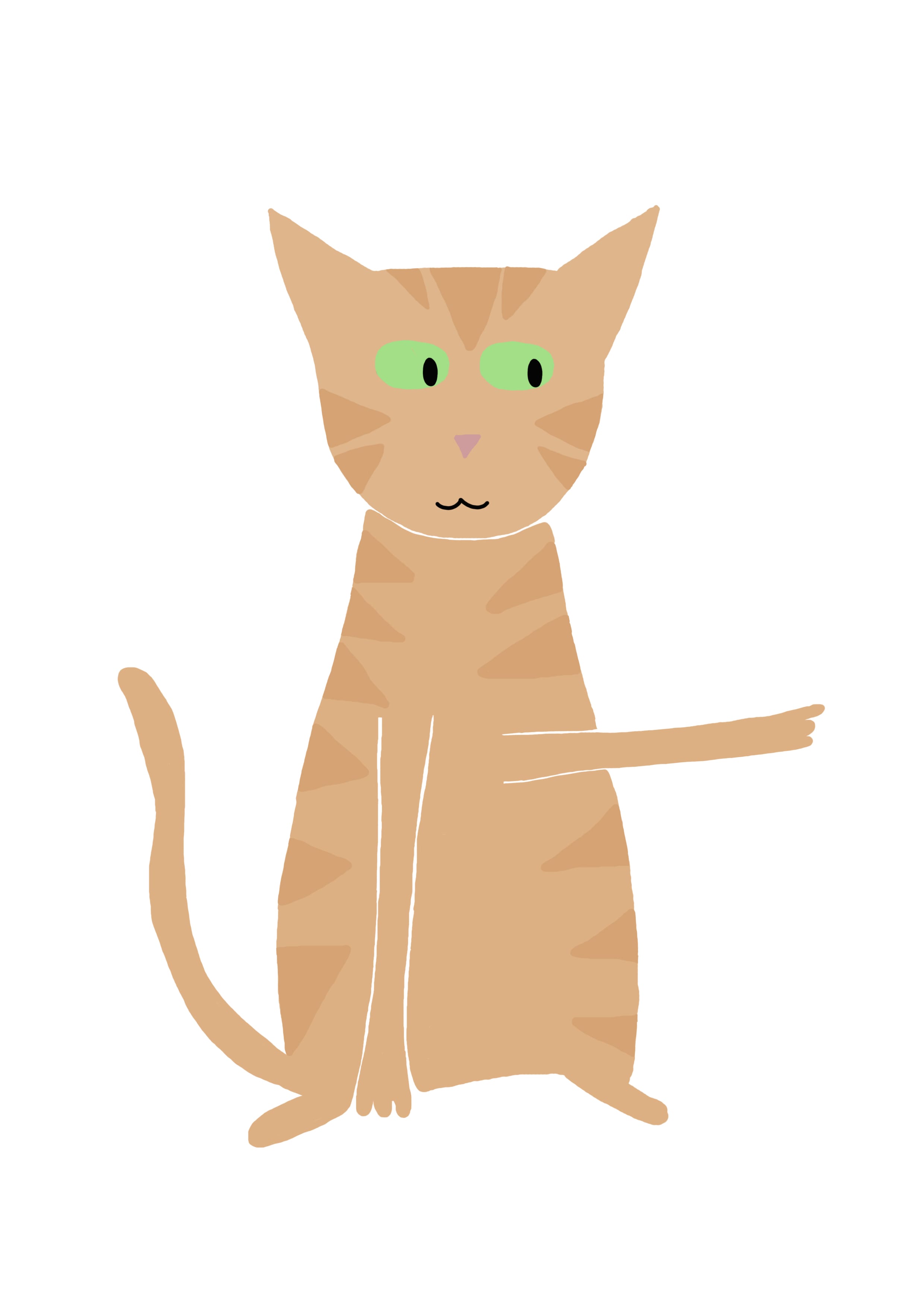
 I feel there is a consistency in the characters illustrations after the improvements I made, with the exception of the cat ‘Blue’ (which currently sticks out like a sore thumb, as he looks more like a rabbit). Before the deadline, it would be great if I could improve him and implement him into the final book.
Mike mentioned how the eyes of each character were different but I like this about them as there is still a continued style throughout. This feature just highlights the differences between cats as the book is all about differences after all. (Even if cats have similar eyes in real life, this is a children’s book – anything can happen!).
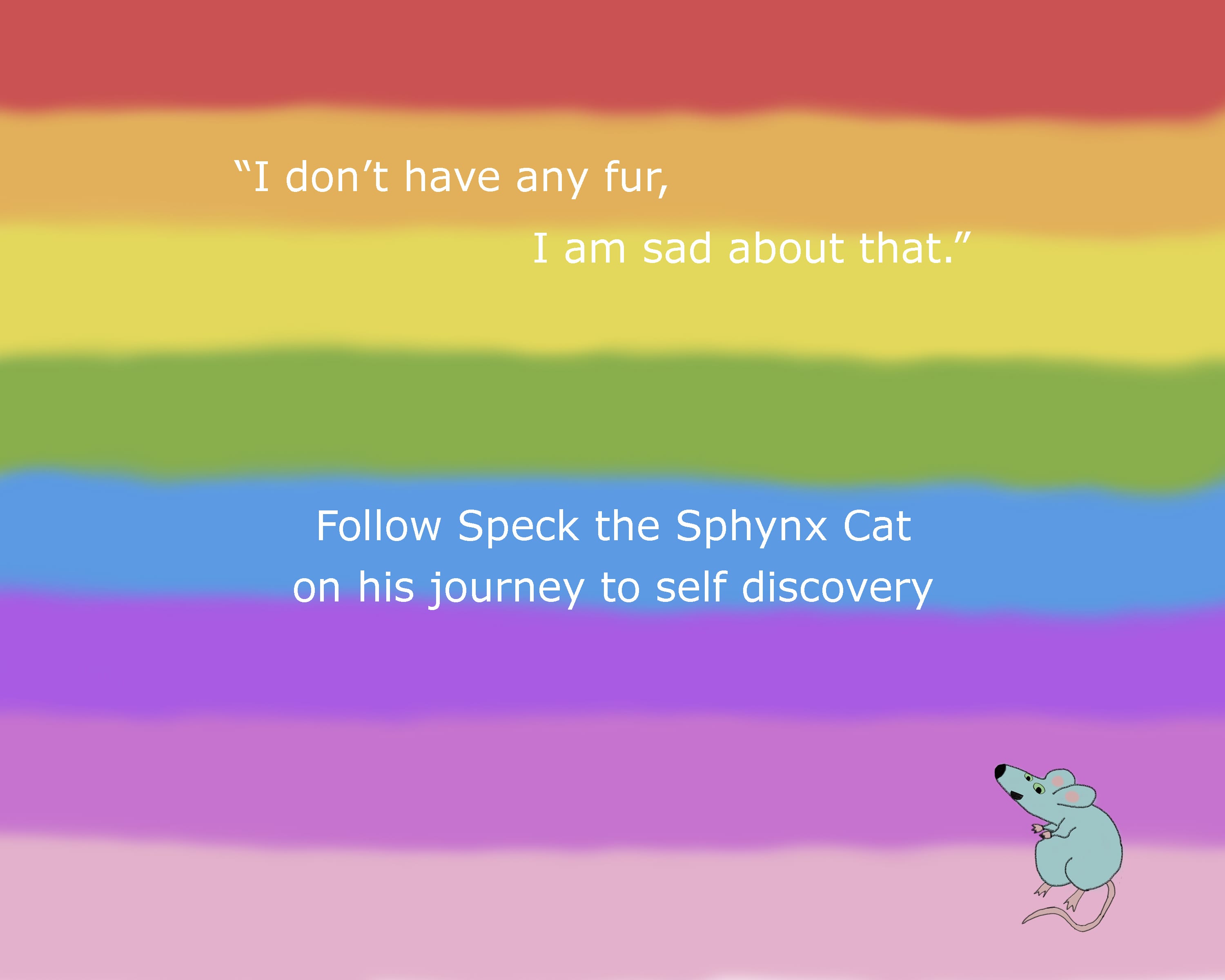
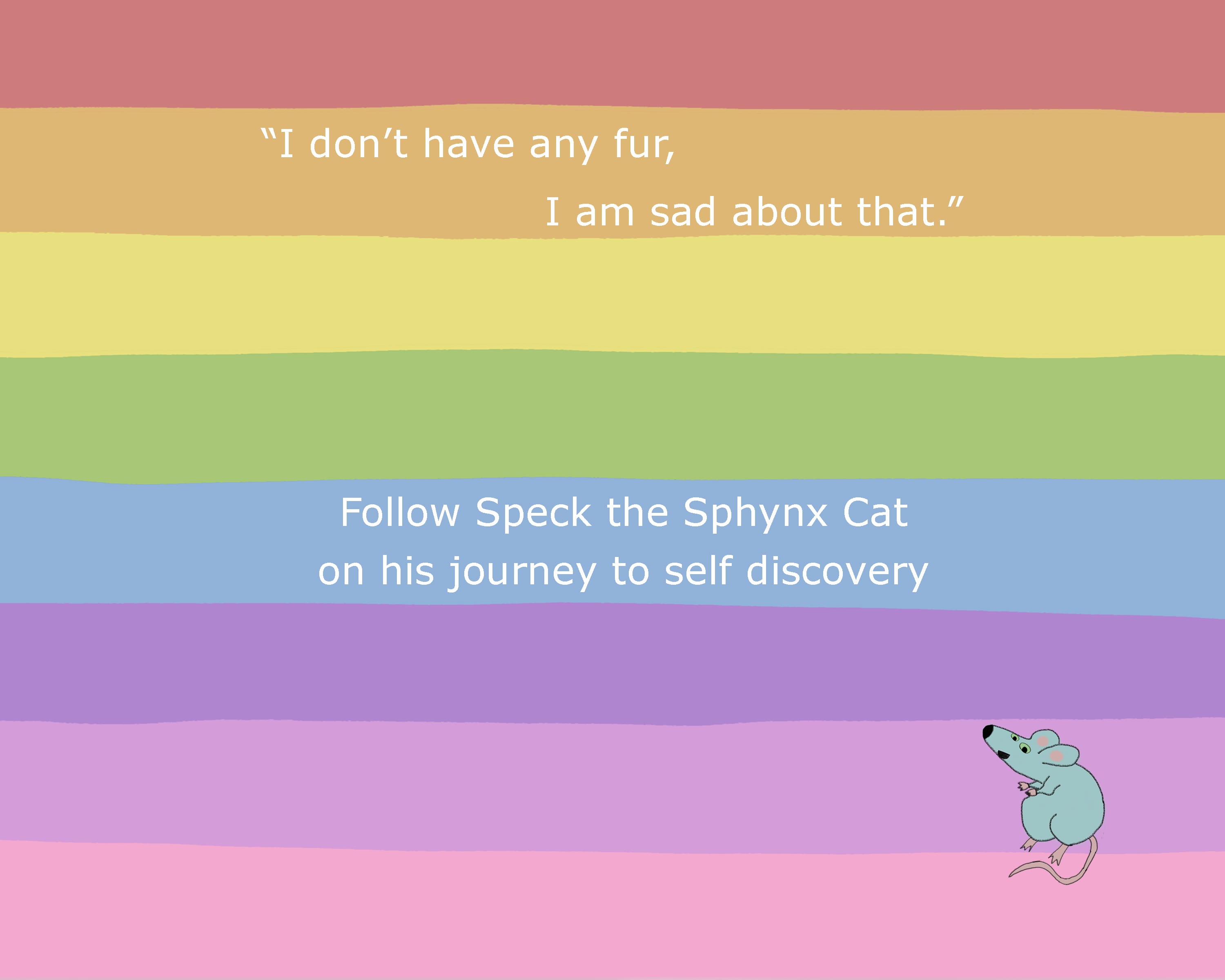
I am happy with my choice to keep the backgrounds a plain colour with no supporting illustrations as I wanted to keep it minimalistic, yet be effective to the story. My favourite page is the double page spread with the rainbow background – especially after my audience feedback where some parents told me this was their child’s favourite page as they could see all the characters and choose their favourite.
Also looking back on my audience feedback, all of the responses told me that the child picked up on the message of the book which makes me see this book as successful as it accomplished the aims and objectives – to let children know they should be proud of their differences!